|
|
Post by arfetto on May 10, 2022 17:30:51 GMT -5
One thing I forgot to mention about Groo is that in the last two issues of the Marvel/Epic series the skeleton in the logo changes. In issue 119 its jaw is visible. In issue 120, the last issue, a tongue hangs from it.
I always liked this Appleseed logo: 
Perhaps it is a bit hard to read, but it fits the tone of the story and art. Years later Dark Horse would reprint the story with a less interesting (to me) logo: 
I also really like this logo:
It incorporates five stars, and two of those stars dot the "i"s.
|
|
|
|
Post by Prince Hal on May 10, 2022 21:11:17 GMT -5
The classic Amazing Spider-Man logo, I've always loved all the webbing around it:  The early Green Lantern logo:  And similar much later on (I think the prior one is a bit more striking):  Two out of three ain't bad. For me, the best Earth-One GL logo was this one...  |
|
|
|
Post by Prince Hal on May 10, 2022 21:16:26 GMT -5
Three longtime favorites. (Notice the similarity.)    Oh, and PS: Have always loved the classic Hawkman logo, too. |
|
|
|
Post by jason on May 10, 2022 22:42:11 GMT -5
I always dug this Iron Man logo:  |
|
|
|
Post by tonebone on May 11, 2022 8:50:34 GMT -5
Speaking of Swamp Thing, I found the original art for the logo... pretty cool!  |
|
|
|
Post by tonebone on May 11, 2022 8:51:29 GMT -5
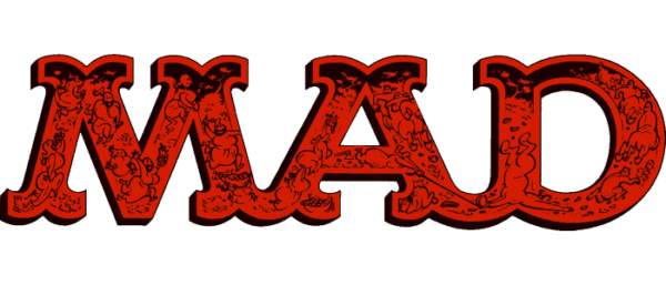
Mad Magazine has had several different iterations over the years... this one is my favorite.  |
|
|
|
Post by tonebone on May 11, 2022 8:53:14 GMT -5
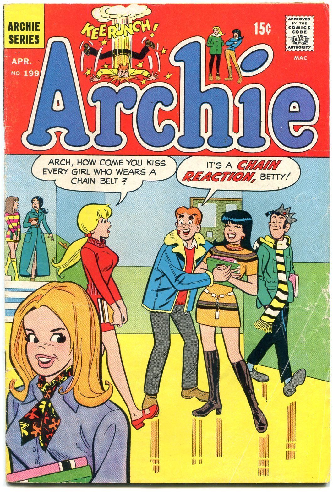
The Archie logo has remained pretty much the same for a LONG TIME.  |
|
|
|
Post by badwolf on May 11, 2022 9:19:41 GMT -5
I always dug this Iron Man logo:  I didn't like that one. It's too big and bulky--like his new armor. |
|
|
|
Post by Prince Hal on May 11, 2022 10:36:15 GMT -5
Any comparison between logos in the Silver Age begins and ends with paying tribute to the work of Ira Schnapp, the genius who designed the lion's share of DC's logos, in addition to its very stylish house ads.
Marvel, for all the vitality of its art and stories in the early to mid-60s, couldn't hold a birthday candle to DC when it came to logos. With the notable exception of the excellent Ditko-designed (?) Spider-Man logo posted above (the webbing was such a perfect touch), most of the Marvel logos were composed of block letters. A few, like Rawhide Kid, Sgt. Fury and Thor, would "tatter" the edges of the letters, I guess to make them look more like adventure-oriented heroes (?) and the romance titles logos were written in script, I guess to make them look more "feminine." The Fantastic Four looked "cartoony" to me, but of course it became more beloved as the comic became better and better. I grew to love it for its very anachronistic uniqueness. Ironically it was replaced by a bland block-lettered logo that would ahve been more like the Marvel loogs of the early 60s.
The other major publishers -- Charlton, Dell, Gold Key -- were like Marvel in that regard, with logos that were at best simple and similar, and at worst sloppy and uninspired.
Meanwhile, the Archie logos, though they all used the same style for logos as part of what today I think they'd call "trade dress," at least stood out for their neatness and precision.
|
|
|
|
Post by MDG on May 11, 2022 11:22:08 GMT -5
Any comparison between logos in the Silver Age begins and ends with paying tribute to the work of Ira Schnapp, the genius who designed the lion's share of DC's logos, in addition to its very stylish house ads. Marvel, for all the vitality of its art and stories in the early to mid-60s, couldn't hold a birthday candle to DC when it came to logos. With the notable exception of the excellent Ditko-designed (?) Spider-Man logo posted above (the webbing was such a perfect touch), most of the Marvel logos were composed of block letters.... Yes--DC's logos, although often planned and precise (like DC's house style) had a lot of flair and style that kept a hand-done look, like the large initial cap and close kerning on Hawkman...
...or the unique letterforms on Aquaman...
|
|
|
|
Post by Prince Hal on May 11, 2022 13:23:07 GMT -5
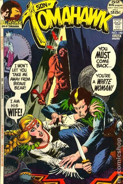
One of the weirdest logo changes occurred in Tomahawk . The lettering and design of the original logo was lighthearted and cutesy-looking, and even with the drawing of the tomahawk, looked out of character with an adventure title. But it was the 1950s, so maybe DC wanted to be cautious. As of issue 55, the logo changed, and though a bit bland, at least it melded form and content in a clear simple design. This logo lasted through #98 when it was replaced in #99 with one that made the tomahawk a tad more menacing and highlighted the title's historical connections with a red, white and blue color scheme. All good, except that...    that logo never reappeared. The title reverted to the previous logo, which remained atop the cover until 110, when a more rugged-looking design appeared. That logo, the best of them, IYAM, remained until the title changed to spotlight Tomahawk's son Hawk in issue 131. Understandable, as it was an attempt to save the comic. I'm guessing it was a Joe Kubert design, complete with a Marvel-ish image in the upper left-hand corner. Get this, though. In its last issue, Kubert tried a new logo, an excellent one that captured not just ruggedness, but violence as well. One wonders if that logo had been used earlier if it would have made the change to "Son of" more interesting to readers. Anyway, Tomahawk twice used a completely different logo for one issue only. I'd say that's a rare occurrence. I know more than I should about this long-running but decidely niche-market comic. Forgive me. I will take my meds as soon as I post this.     |
|
|
|
Post by MDG on May 11, 2022 13:35:34 GMT -5
For more stuff on comic logos (especially DC), you can go to Todd Klein's blog where there's plenty of history and examples like this:  |
|
|
|
Post by badwolf on May 11, 2022 14:16:11 GMT -5
|
|
|
|
Post by dbutler69 on May 11, 2022 15:51:18 GMT -5
I've always kinda liked this one. Maybe because it was the current logo when I was growing up.  |
|
|
|
Post by MWGallaher on May 11, 2022 21:49:56 GMT -5
The other major publishers -- Charlton, Dell, Gold Key -- were like Marvel in that regard, with logos that were at best simple and similar, and at worst sloppy and uninspired. Someone once made the observation that Gold Key's logos mostly looked like they were done by people who were experienced in toy packaging. That may have worked well for them in appealing to their target audience, but it was a big turn-off to me when I started collecting at the age of 11. I wanted evocative, carefully crafted logos, and I was as likely to copy good logos in my sketchbook as I was to copy drawings of characters themselves. |
|