|
|
Post by tonebone on May 12, 2022 8:49:23 GMT -5
I kept reminding myself to post that one! Sheer genius! I am also fascinated with those guys who can create typography that can be read upside down... 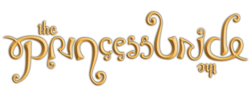 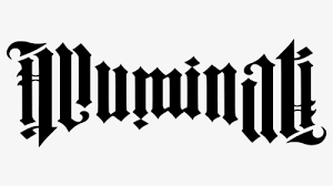 |
|
|
|
Post by tonebone on May 12, 2022 8:59:56 GMT -5
The other major publishers -- Charlton, Dell, Gold Key -- were like Marvel in that regard, with logos that were at best simple and similar, and at worst sloppy and uninspired. Someone once made the observation that Gold Key's logos mostly looked like they were done by people who were experienced in toy packaging. That may have worked well for them in appealing to their target audience, but it was a big turn-off to me when I started collecting at the age of 11. I wanted evocative, carefully crafted logos, and I was as likely to copy good logos in my sketchbook as I was to copy drawings of characters themselves. I never thought about toy packaging, but that would make sense, being Whitman/Western and all... I always thought old school magazine production. Ususally, Gold Key's logos were typographic (sometimes hand drawn, i'll admit) "knockouts", where they just were sort of an a solid-color area where the full color didn't print. It always had a sort of cheap look to me, in contrast to the fantastic cover paintings. 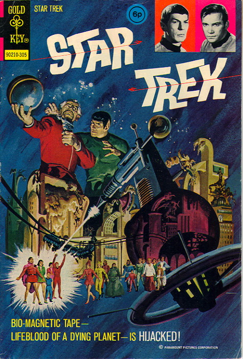   |
|
|
|
Post by badwolf on May 12, 2022 9:08:11 GMT -5
I kept reminding myself to post that one! Sheer genius! I am also fascinated with those guys who can create typography that can be read upside down...   I had the bluray with that Princess Bride title! Apparently this sort of thing is called an ambigram. |
|
|
|
Post by MDG on May 12, 2022 9:56:25 GMT -5
I kept reminding myself to post that one! Sheer genius! I am also fascinated with those guys who can create typography that can be read upside down...   I had the bluray with that Princess Bride title! Apparently this sort of thing is called an ambigram. At one time, I was talking to a graphics teacher here about an assignment where students had to redesign a logo for a cement company--since when the barrels on the trucks are rotating, the logo is upside down half the time, could they design one that would always read correctly? |
|
|
|
Post by tonebone on May 12, 2022 9:58:34 GMT -5
I always dug this Iron Man logo:  That's a great one, but I also really like this version, which is my favorite era of Iron Man, as well...  |
|
|
|
Post by tonebone on May 12, 2022 10:25:25 GMT -5
The original Capitol Comics NEXUS logo was really well done. Richard Bruning was the Art Director, before he moved on to DC, I think.  |
|
Confessor
CCF Mod Squad
Not Bucky O'Hare!
Posts: 10,202 
|
Post by Confessor on May 13, 2022 0:49:30 GMT -5
Star Wars... such a great logo that the comic version was adopted by Lucasfilm as the official logo for the film. Yep, whoever did the logo for the Marvel production staff set the standard for how to represent ALL of Star Wars licensing... the big innovation was linking the ST and RS letters (R and S were not linked until a few issues in, tho). Lucasfilm took the logo and refined it for use on the posters, toys, posters, underoos, etc.  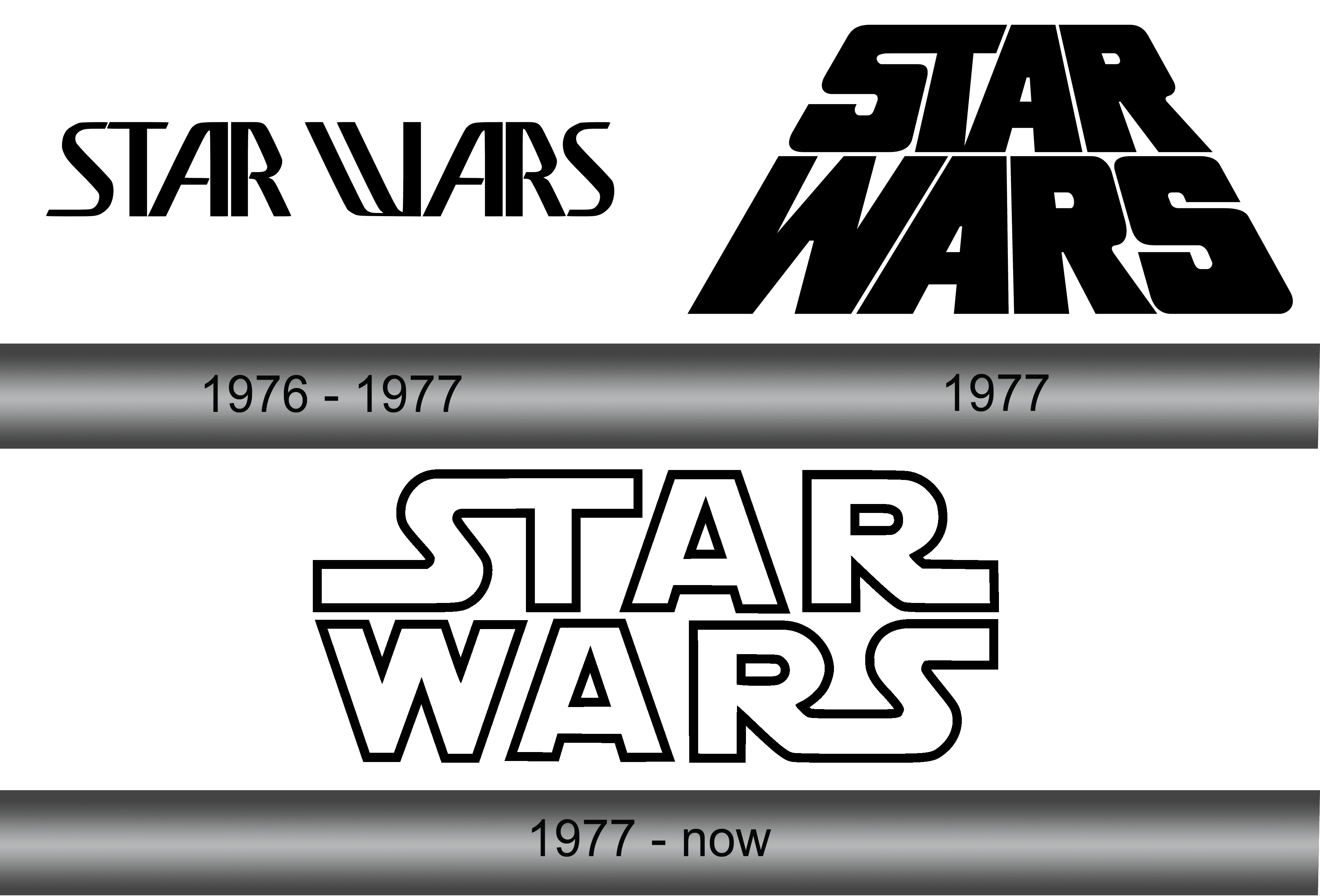 That's not right. The Star Wars logo used on the Marvel comic and seen at the start of the film was commissioned by Lucasfilm from typographer/designer Suzy Rice -- it was based on a WW2 Nazi font, believe it or not! -- and then slightly modified by the film's concept artist Joe Johnston. Marvel were given this logo by Lucasfilm and told to use it to keep the comic in line with the look of the film. I have no idea why the S and T, and the R and S weren't joined together on the cover of Marvel's Star Wars #1 (it was fixed from issue #2 onwards), but these pairs of letters were joined together even in Rice's early, more angular logo design. Interestingly, the S and T were joined together in Dan Perri's slightly earlier, slanting "crawl" logo design, so the idea of having certain letters flowing into each other was likely his, and Rice just incorporated the same idea. You can find some fairly in-depth articles about Suzy Rice's design process online, but here's a pretty straightforward blog post that discusses the history of the various SW logos... 99designs.co.uk/blog/famous-design/star-wars-logos/ |
|
|
|
Post by tonebone on May 13, 2022 7:48:45 GMT -5
Star Wars... such a great logo that the comic version was adopted by Lucasfilm as the official logo for the film. Yep, whoever did the logo for the Marvel production staff set the standard for how to represent ALL of Star Wars licensing... the big innovation was linking the ST and RS letters (R and S were not linked until a few issues in, tho). Lucasfilm took the logo and refined it for use on the posters, toys, posters, underoos, etc.   That's not right. The Star Wars logo used on the Marvel comic and seen at the start of the film was commissioned by Lucasfilm from typographer/designer Suzy Rice -- it was based on a WW2 Nazi font, believe it or not! -- and then slightly modified by the film's concept artist Joe Johnston. Marvel were given this logo by Lucasfilm and told to use it to keep the comic in line with the look of the film. I have no idea why the S and T, and the R and S weren't joined together on the cover of Marvel's Star Wars #1 (it was fixed from issue #2 onwards), but these pairs of letters were joined together even in Rice's early, more angular logo design. Interestingly, the S and T were joined together in Dan Perri's slightly earlier, slanting "crawl" logo design, so the idea of having certain letters flowing into each other was likely his, and Rice just incorporated the same idea. You can find some fairly in-depth articles about Suzy Rice's design process online, but here's a pretty straightforward blog post that discusses the history of the various SW logos... 99designs.co.uk/blog/famous-design/star-wars-logos/Yeah.. I read that... My info was derived from my memory of an article in Alter Ego (I think) where either Chaykin or the PR manager (who coordinated the creation of the comic) said that the original design for issue 1 came BEFORE the Suzy Rice design... The joining of the letters, it was said, was the idea of the cover letterer, which came along with the 2nd issue, and at that point, she integrated into the movie title. HOWEVER, that info I was relaying is probably wrong (misremembered by the PR guy?), after reading this comprehensive page: pittsburghjedi.com/star-wars-logo-origin-development/I did find it interesting that the letter W in Wars continued to change and evolve, through the Rice logo, the Jim Novak comics logo, and Joe Johnston's changes, and more subtle changes over the next 30 or so years! At any rate, thanks Confessor for calling me on it... I will try to find the article I was referencing, which was really interesting, but they constantly say "Whew that was a long time ago... let me see if I remember."... that was probably a red flag I should have heeded.  |
|
|
|
Post by mikelmidnight on May 13, 2022 11:18:10 GMT -5
I'm surprised nobody has mentioned this one:  Not only does it display the Earths in context, but it has a lot going on and yet is amazingly readable! |
|
|
|
Post by Prince Hal on May 13, 2022 11:47:41 GMT -5
|
|
|
|
Post by arfetto on May 13, 2022 15:24:35 GMT -5
I liked that the Invisibles logo would be "invisible" so that the background image showed through.
I liked this Catwoman logo because the "C" was like an imprint left behind by a cat's tail, like it was into paint or, when red, blood.
Though the color choices were not always the easiest to read, I liked the futuristic "bullet holes" for the Eclipse Dirty Pair logo: 
For the "holes" in letters or to dot the "i"s.
As Warren's Dirty Pair progressed, the logo sometimes lost the bullet hole motif.
At Dark Horse usually the "i"s were no longer bullet holes, but the interiors of the letters still were.
Except sometimes the entire concept was abandoned: 
This last logo does not look as good to me as the previous two.
|
|
|
|
Post by MWGallaher on May 13, 2022 15:58:28 GMT -5
This has got to be one of the impressive ones I've seen--amazingly creative and all for what was likely to be a one-time use:  |
|
|
|
Post by SJNeal on May 13, 2022 22:16:26 GMT -5
|
|
|
|
Post by Mister Spaceman on May 13, 2022 23:33:39 GMT -5
Only used for this issue but so good.  |
|
|
|
Post by Mister Spaceman on May 13, 2022 23:46:48 GMT -5
All the Warren mags had solid logos but the one for Blazing Combat was the best. 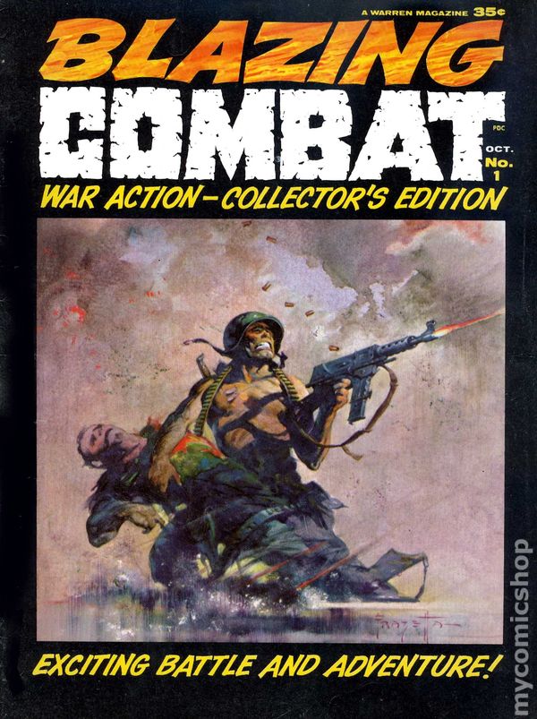 |
|