|
|
Post by Deleted on Dec 28, 2014 22:07:58 GMT -5
pakehafulla - Great Pictures that you've shared with us today. Thanks for posting these!
|
|
|
|
Post by berkley on Dec 29, 2014 4:32:03 GMT -5
Possibly; but perhaps it's more likely that both Kirby and Giger were inspired by similar images in Von Däniken's books or the "documentary" based on his ideas, Chariots of the Gods. This is where the smart money would be, berk. At least, in my opinion. Seems the most likely explanation. I haven't read a lot about Giger, but I've never heard of anything to suggest he was particularly interested in comics or BD. I always had the impression that he came from a fine arts background and only became connected with pop culture when musicians and film-makers began to seek him out. My first exposure to his work was the ELP album, Brain Salad Surgery. |
|
|
|
Post by berkley on Dec 29, 2014 4:44:47 GMT -5
I could quote and comment on almost every panel pakehafulla has posted but this one is a particular favourite. I'm not sure many later artists or writers have managed to capture this aspect of Barda and the Furies: most seem to present them as very formal and rigid, but they're actually much more rough and ready - more like Nick Fury and the Howling Commandos than the caricature of Prussian military discipline we usually get. As they could have seen for themselves if they'd looked at Barda's dialogue and body language, right from her very first appearances. I always thought the unnamed blonde cleaning her gun in the left mid-ground should have become one of the prominent Furies, but I don't remember seeing her used anywhere outside this double-page spread. |
|
|
|
Post by gothos on Dec 29, 2014 13:06:34 GMT -5
Cool, glad I'm getting it right. Well gosh, I'm blushing kind sir... Its really just a case of grabbing all the double page spreads from Kamandi and Eternals, plus a few splash pages, to showcase the power of his work. Just seeing the pages together, at a decent size reinforces his talent in my mind. He really was the king of the splash page and the double page spread, wasn't he. The New Gods, The Demon, Devil Dinosaur also sport a number of outstanding examples. I'm sure OMAC does too, but I can't remember any off the top of my head right now. I find this to be a weakness with many of even the best current-day comics artists - their full page panels and double page spreads often feel pointless and flat rather than the dramatic highpoints or simply awe-inspiring spectacles Kirby and others used to give us. I was reading the Guardians of the Galaxy Annual last week and Frank Cho - who is I think is generally under-rated as a superhero artist - had one or two double page spreads that seemed almost like a wast of space to me, and another that was only partially saved by half of it being taken up with a nice full-length portrait of "The Countess", from Steranko's Nick Fury. With a lot of current artists, I often get the feeling that they devote a double page spread to, say, a big spaceship, just to save themselves some work, not because they feel that the dramatic flow of the story calls for one or even that they just have an awesome design for a spaceship that they want to make as spectacular as they can. Modern comics artists may be imitating what they see in big FX films of current years. There's a lot of attention to big objects or beasties, but it's rare to find modern movie-makers who are good at paegantry. Kirby's mastery of the spectacle shows his genius from translating big-budget film spectacles onto a comics-page. |
|
|
|
Post by Paste Pot Paul on Dec 29, 2014 14:32:27 GMT -5
Actually it struck me yesterday as I was getting these pictures ready, that on Mr Miracle at least, Vinnie Colletta really suited Jack for a change, must have been a slow period huh...
|
|
|
|
Post by Paste Pot Paul on Dec 31, 2014 1:35:52 GMT -5
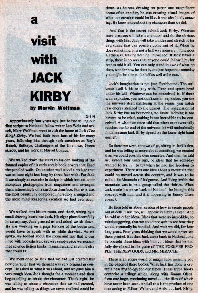
 So...look at the end of paragraph 6..."a wise man once said that when man finally reaches the far end of the universe, he will undoubtedly find the name Jack Kirby signed on the lower right hand corner." Is there any other creator in the field of comics that could come close to that? Anyone? |
|
|
|
Post by Deleted on Dec 31, 2014 13:13:38 GMT -5
Except for some Kamandi & Demon issues, I have never read any Kirby DC comics. Is Mister Miracle a good read??
|
|
|
|
Post by marvelmaniac on Dec 31, 2014 20:32:44 GMT -5
It was these 2 books that got me hooked on Marvel back when I was a young lad of 8.  This copy of F.F.#8 was given to me as a gift back in 83/84 with the Jack Kirby autograph on the bottom of the splash page. Is it authentic???  |
|
|
|
Post by hondobrode on Dec 31, 2014 20:58:12 GMT -5
Except for some Kamandi & Demon issues, I have never read any Kirby DC comics. Is Mister Miracle a good read?? Mr Miracle, Forever People, Jimmy Olsen and the New Gods all fit together and are pretty unique, though Kirby never got to finish them properly due to cancellation. O.M.A.C. One Man Army Corps rocks too. |
|
|
|
Post by wildfire2099 on Jan 3, 2015 17:57:06 GMT -5
I hope you guys will agree this splash is worth a large-size posting.. it's my favorite from Devil Dinosaur, among several great ones. Not the best story ever, but really some fantastic art. I wrote a review over in the overview thread for those interested.   |
|
|
|
Post by junkmonkey on Jan 3, 2015 18:47:31 GMT -5
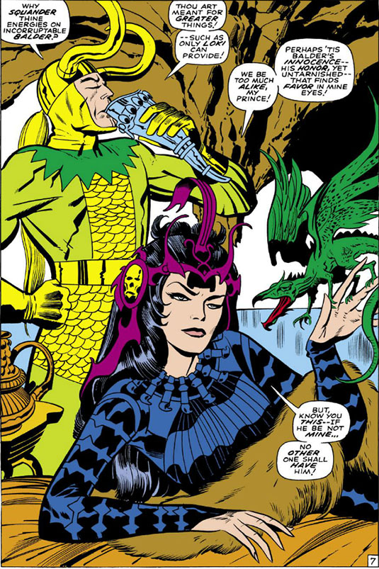
![]() Couldn't find one with the original colouring, unfortunately, but I like this rendition of Karnilla:  Please forgive what may be a really dumb question from a newbie - both here and to the world of comics - but who did the colouring on Kirby's work where there is no specific colourist named? I ask because I recently bought a copy of a (1984?) reprint of his New Gods 1+2 and was horrified at how crap the colouring looked in comparison to the originals. The colour had not only rendered as solid blocks - no Beday dots - but changed as well so that once shadowy background figures leap out of the page like pantomime dames, and, even worse, they changed the colour of Orion's helmet and gloves. In the original they are a pale purple, in the recoloured they're blue. The original pale purple is - by an amazing coincidence - the same colour as Darkseid's skin. As it turns out later that Orion is Darkseid's son this is a neat piece of foreshadowing that is completely thrown away. I have most of the series now in the originals and even frail and battered after forty years, they still look better than the lurid reprint. |
|
Confessor
CCF Mod Squad
Not Bucky O'Hare!
Posts: 10,200 
|
Post by Confessor on Jan 3, 2015 22:39:11 GMT -5
![]() Couldn't find one with the original colouring, unfortunately, but I like this rendition of Karnilla:  Please forgive what may be a really dumb question from a newbie - both here and to the world of comics - but who did the colouring on Kirby's work where there is no specific colourist named? I ask because I recently bought a copy of a (1984?) reprint of his New Gods 1+2 and was horrified at how crap the colouring looked in comparison to the originals. The colour had not only rendered as solid blocks - no Beday dots - but changed as well so that once shadowy background figures leap out of the page like pantomime dames, and, even worse, they changed the colour of Orion's helmet and gloves. In the original they are a pale purple, in the recoloured they're blue. The original pale purple is - by an amazing coincidence - the same colour as Darkseid's skin. As it turns out later that Orion is Darkseid's son this is a neat piece of foreshadowing that is completely thrown away. I have most of the series now in the originals and even frail and battered after forty years, they still look better than the lurid reprint. There are no stupid questions...or so they say. I'm not familiar with the series at all, but according to the Grand Comics Database (a fantastic resource that you should become acquainted with -- find it here), it was someone called Anthony Tollin who did the colouring on issues #1 and #2 of the 1984 New Gods reprint series. |
|
|
|
Post by hondobrode on Jan 4, 2015 1:09:46 GMT -5
![]() Couldn't find one with the original colouring, unfortunately, but I like this rendition of Karnilla:  Please forgive what may be a really dumb question from a newbie - both here and to the world of comics - but who did the colouring on Kirby's work where there is no specific colourist named? I ask because I recently bought a copy of a (1984?) reprint of his New Gods 1+2 and was horrified at how crap the colouring looked in comparison to the originals. The colour had not only rendered as solid blocks - no Beday dots - but changed as well so that once shadowy background figures leap out of the page like pantomime dames, and, even worse, they changed the colour of Orion's helmet and gloves. In the original they are a pale purple, in the recoloured they're blue. The original pale purple is - by an amazing coincidence - the same colour as Darkseid's skin. As it turns out later that Orion is Darkseid's son this is a neat piece of foreshadowing that is completely thrown away. I have most of the series now in the originals and even frail and battered after forty years, they still look better than the lurid reprint. Maybe DC had requested it ? Hard to say, but I know lots of times reprints have different coloring than the original. Despite coloring technology getting better over the years, most of the time Classic fans prefer the originals. |
|
|
|
Post by Deleted on Jan 4, 2015 1:14:46 GMT -5
The '84 reprints were on Baxter paper, and original colors from newsprint did not reproduce well on the new paper stock, so DC had them redone for the reprint series, the same way Marvel had recolored a lot of the reprint sin the Special Editions (Warlock, Capt. America, Nick Fury, Dr. Strange) which were done on similar stock. The coloring done in the 80s represented what was "state of the art" for the tech and paper stock used. When Marvel upgraded to flexograph printing a few years later, the similar "bright and solid" look dominated their books that used it, which was a jarring difference form traditional colors done on newsprint.
They were redone out of necessity for the format, but the art direction they chose likely could had been truer to the original, but they were trying to appeal to the state of the art ideal for a modern fan trying to find new audiences for the material. The Hunger Dogs GN by Kirby used a similar coloring palette as well.
-M
|
|
|
|
Post by Deleted on Jan 4, 2015 12:26:34 GMT -5
Original Concept of Spiderman
Jack Kirby Style This is what Jack Kirby had in mind for the Original Concept of SPIDERMAN; however Stan Lee wanted something else and Jack tried his best to pitch this concept but couldn't do so. I was thrilled to get this from a dear friend of mine and he will try his best to get me more of these art for me to share here. This one is interesting because IMO this Spiderman would have failed. I don't believe it would ever have achieved the greatness of the Spider-man we know and love today. This concept eventually became The Fly, which was published by Archie publications and lasted 39 issues. Kirby drew issues #1 and #2. |
|