|
|
Post by Deleted on May 15, 2015 0:19:05 GMT -5
I'm a bit surprised that NO ONE ever thought about starting up a thread for all of us to discuss what is your BEST COMIC BOOK LOGO is and why? ... Mine and Foremost is the classic Justice League of America Logo - See Below  This is my favorite one - from Justice League of America #138 What so cool about it - is the word LEAGUE is three tone in RED, WHITE, and BLUE. That's my favorite cover logo wise. It would be cool if we all share our logos it's can be from any comic company - DC Comics, Marvel, Image, Independents, even Foreign Comics too. Be Creative and I would love to see some of the coolest comic book logos around. Have Fun everyone! |
|
|
|
Post by Deleted on May 15, 2015 0:35:19 GMT -5
I have a couple of favorites, all from the Bronze age.... .jpg) The slight angle of the logo always reminded me of the hero about to launch into flight, the rivets just evoked the whole man of metal and the three dimesionality of the letters made it feel like it was coming off the page....  The red white and blue color scheme fit the character and the curvature of the letters read waving flag for me, which was appropriate for the character. Both this and the Iron Man logo above leapt off the spinner rack and let you know immediately who the comic was, which is exactly what the logo was intended to do. 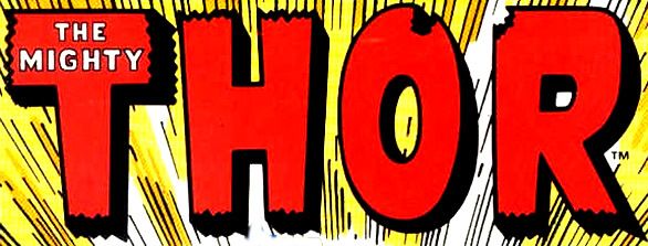 The ragged lettering of the Thor logo always fascinated me, especially the chunks missing from the O and R. I spent hours trying to recreate this logo on the page with my magic markers as a kid. The top heavy letters, the moniker The Mighty encased within the T, the jagged edges on ton and bottom and the three-dimensionality of it all giving it that old world vibe was a real winner for me. But my favorite logo (mostly because it was my favorite book)...  The definitive oversized A with the arrow containing THE, the epitaph Earth's Mightiest Heroes above it, the slight angle of the lettering coinciding with the angle of the V making it look like the V was wedge inserted into the overall piece, the wing on the bottom of the G, the shadowed outline of it all, it all just worked for me and was the pinnacle of comic book logos for me. -M |
|
|
|
Post by Earth 2 Flash on May 15, 2015 1:53:28 GMT -5
This is my favorite:

My reasons:
1) It looks cool.
2) It just seems to fit the character's personality and powers so well.
3) It looks cool.
My second favorite is this one, but I don't know why. I have just always loved it.

My third favorite would be the Justice League of America logo that Mechagodzilla posted. (Great thread, by the way.) |
|
|
|
Post by pinkfloydsound17 on May 15, 2015 8:49:11 GMT -5
Great topic! First choice for me would have to be G.I Combat. Something about the staggering of the letters and the boldness just draws me in. Add in the Haunted Tank blurb on top (and Kubert cover of course) and its covers like these that just say "buy me" 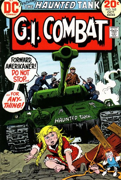 From Marvel, Nick Fury's logos always make me excited. Again, the boldness appeals to me. Even in his second series, the logo was still a part of the artwork. 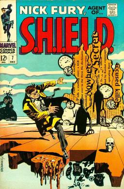 |
|
|
|
Post by wildfire2099 on May 15, 2015 10:42:57 GMT -5
I love it when the logo is part of the cover!
I don't think I've ever really thought about a favorite logo, but I do like where they have some character (like the rivets in Iron Man, or the Green Lantern one), rather than just a font.
|
|
|
|
Post by Pharozonk on May 15, 2015 10:45:01 GMT -5
|
|
|
|
Post by Pharozonk on May 15, 2015 10:46:25 GMT -5
|
|
|
|
Post by Deleted on May 15, 2015 11:58:11 GMT -5
I love it when the logo is part of the cover! I don't think I've ever really thought about a favorite logo, but I do like where they have some character (like the rivets in Iron Man, or the Green Lantern one), rather than just a font. I couldn't agree you more when the logo is part of the cover! ... Thanks for sharing it. |
|
|
|
Post by Deleted on May 15, 2015 12:10:30 GMT -5
My favorite DC Comics Logo I just loved the simplicity of Black and Red Lettering - So crisp and clear! My favorite Marvel Comics Logos - Actually two are tied for 1st Place! One thing that I liked about it - is the mini-heads of their popular heroes surrounding a very plain and bold logo of MARVEL in the center. It's classic logo - bar none.  It's the Marvel Studios Avengers Logo - it's hip, modern, and most of all - it's embodied class.
|
|
Crimebuster
CCF Podcast Guru
Making comics!
Posts: 3,958 
|
Post by Crimebuster on May 15, 2015 12:30:49 GMT -5
Can't beat these classics:  I never really liked this one. Too blocky for me. I much prefer the one just before it:  |
|
Crimebuster
CCF Podcast Guru
Making comics!
Posts: 3,958 
|
Post by Crimebuster on May 15, 2015 12:35:39 GMT -5
|
|
|
|
Post by fanboystranger on May 15, 2015 13:03:48 GMT -5
It's not as well known as most of the other logos that people have been posting, but one of my favorites is for the short-run Vertigo series Deadenders. I love it's design-- the lower case letters, the arrow under the "dead" part ('cause these characters were going nowhere), the go-go checks running down the side of every issue. It really nails the spirit of the series.
Attachment Deleted
|
|
|
|
Post by Pharozonk on May 15, 2015 13:04:47 GMT -5
|
|
|
|
Post by fanboystranger on May 15, 2015 13:12:17 GMT -5
Another of my favorites is Rian Hughes' logos for Wildcats 3.0. The logo was intentionally designed to look like a typical corporate logo as that's what the series dealt with, and it would vary slightly from issue to issue. Hughes is, in my opinion, the best contemporary logo designer as well as a vitally important artist in terms of his influence on animated universe design, etc.
Attachment DeletedAttachment DeletedAttachment Deleted
|
|
|
|
Post by MWGallaher on May 15, 2015 14:06:21 GMT -5
The JLA logo is a real classic, and I'm fond of it myself, but when you look closely at it, it's rather sloppy.
The stars have a rushed, hand-drawn look. The borders around "Justice" and "America" are inconsistent, and depending on the color scheme, can look even sloppier than they are (see JLA #10, where the red center letters of the white-bordered "Justice" look like they were casually filled in with a felt-tip marker). The 'S' in "Justice" is thicker on the top stroke than the bottom. Although "League" is thicker than the other two main words, it's in the same letter style...except for the 'A', which is in a different style than the ones in "America". The shield background looks good unless the logo is tilted as it is on the JLA #138 above; then what was a visual suggestion of three dimensional depth just becomes asymmetry.
Not that I ever noticed any of this when I was younger, but I always expect this style of logo to have a kind of strict formality, a monumental ideal of perfection.
|
|