|
|
Post by hondobrode on May 18, 2015 20:41:35 GMT -5
 I've always loved this logo of DC mid 1970's Swamp Thing, Wonder Woman, Eve (Secrets of Sinister House), Sgt Rock, Captain Marvel, Superman, Batman, Kamandi, Flash, Green Lantern, Cain, Aquaman, Tarzan |
|
|
|
Post by DE Sinclair on May 19, 2015 9:40:49 GMT -5
 I've always loved this logo of DC mid 1970's Swamp Thing, Wonder Woman, Eve (Secrets of Sinister House), Sgt Rock, Captain Marvel, Superman, Batman, Kamandi, Flash, Green Lantern, Cain, Aquaman, Tarzan I had this once, but it was lost when I moved out of my parents house. I've looked many times on Ebay, but can't find it for less than $50. Often the asking price is well over $100. <sigh> |
|
|
|
Post by hondobrode on May 19, 2015 10:11:06 GMT -5
Yeah, I think that's the hardest issue to find.
I'd love it if DC would reprint these, but it'll probably never happen.
|
|
|
|
Post by Reptisaurus! on May 19, 2015 18:53:16 GMT -5
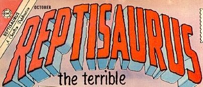 I mean, obviously. |
|
|
|
Post by Deleted on May 25, 2015 17:48:58 GMT -5
Miss America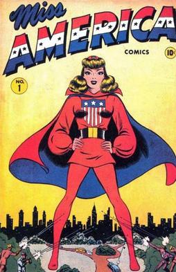  I've always a sucker for the Red, White, Blue logos that's looks patriotic (US Flag) and this one is one of the first of it's kind.
|
|
|
|
Post by dupersuper on May 26, 2015 1:10:36 GMT -5
I've always a sucker for the Red, White, Blue logos that's looks patriotic (US Flag) I've always been wary of them, but then I'm a Canadian... |
|
|
|
Post by Deleted on May 26, 2015 2:56:29 GMT -5
I've always a sucker for the Red, White, Blue logos that's looks patriotic (US Flag) I've always been wary of them, but then I'm a Canadian... I've many friends are Canadians and I do respect their Maple Leaf Flag as well as their customs too. |
|
|
|
Post by dupersuper on May 26, 2015 3:30:55 GMT -5
Ah yes: our proud Canadian maple leaf. "Don't mess with Canada or we'll...dry up and blow away".
|
|
|
|
Post by Nowhere Man on May 26, 2015 10:00:47 GMT -5
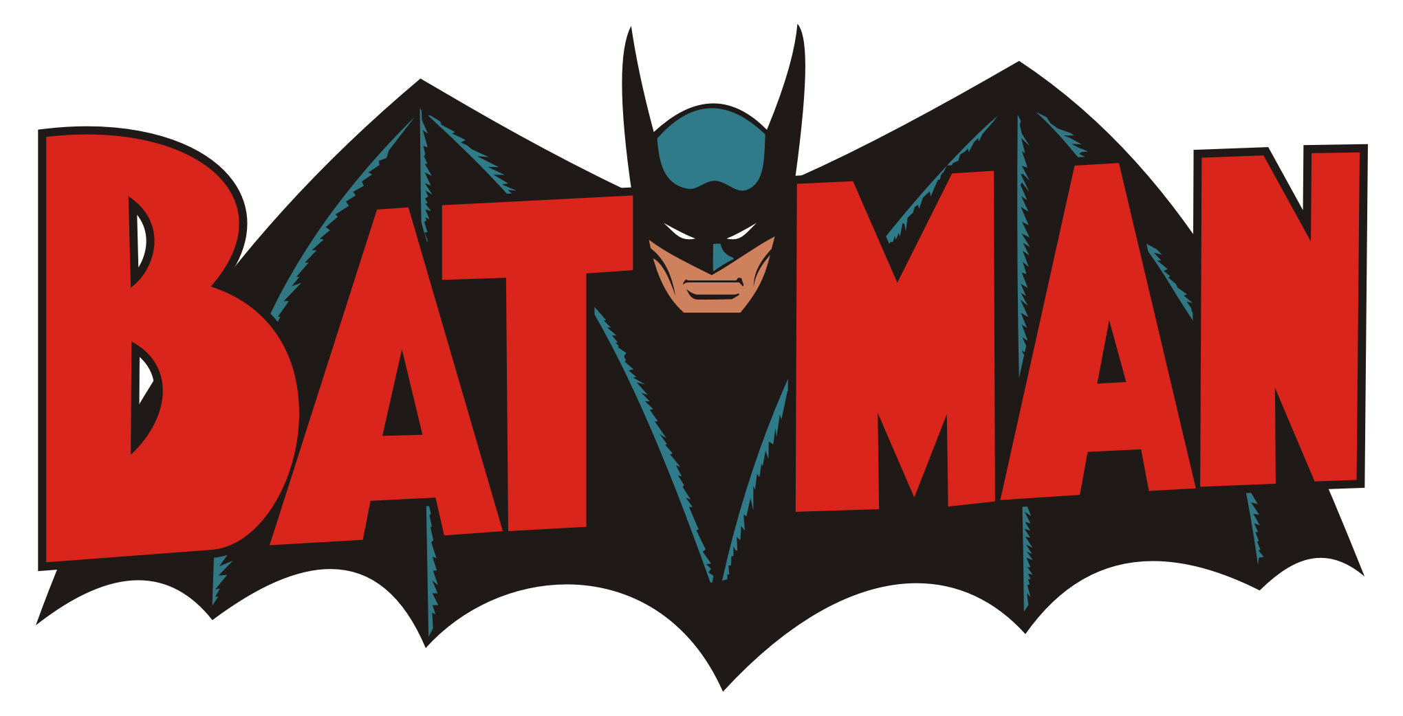  If I had to choose, it's a tie between these two. (I always loved this Thor logo. Didn't it debut at the beginning of Walt Simonson's run?) |
|
|
|
Post by Deleted on May 26, 2015 14:30:57 GMT -5
It debuted with Simonson's second issue (#338) 337 showed the old logo being smashed as Beta Ray Bill swung his hammer.... 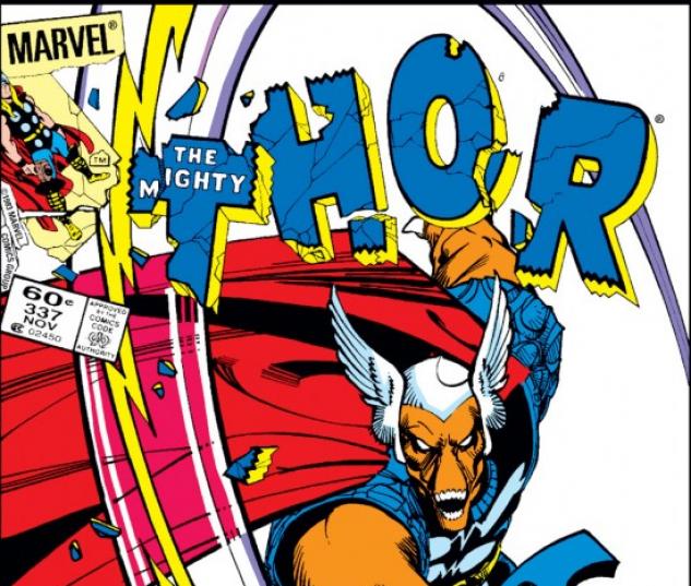 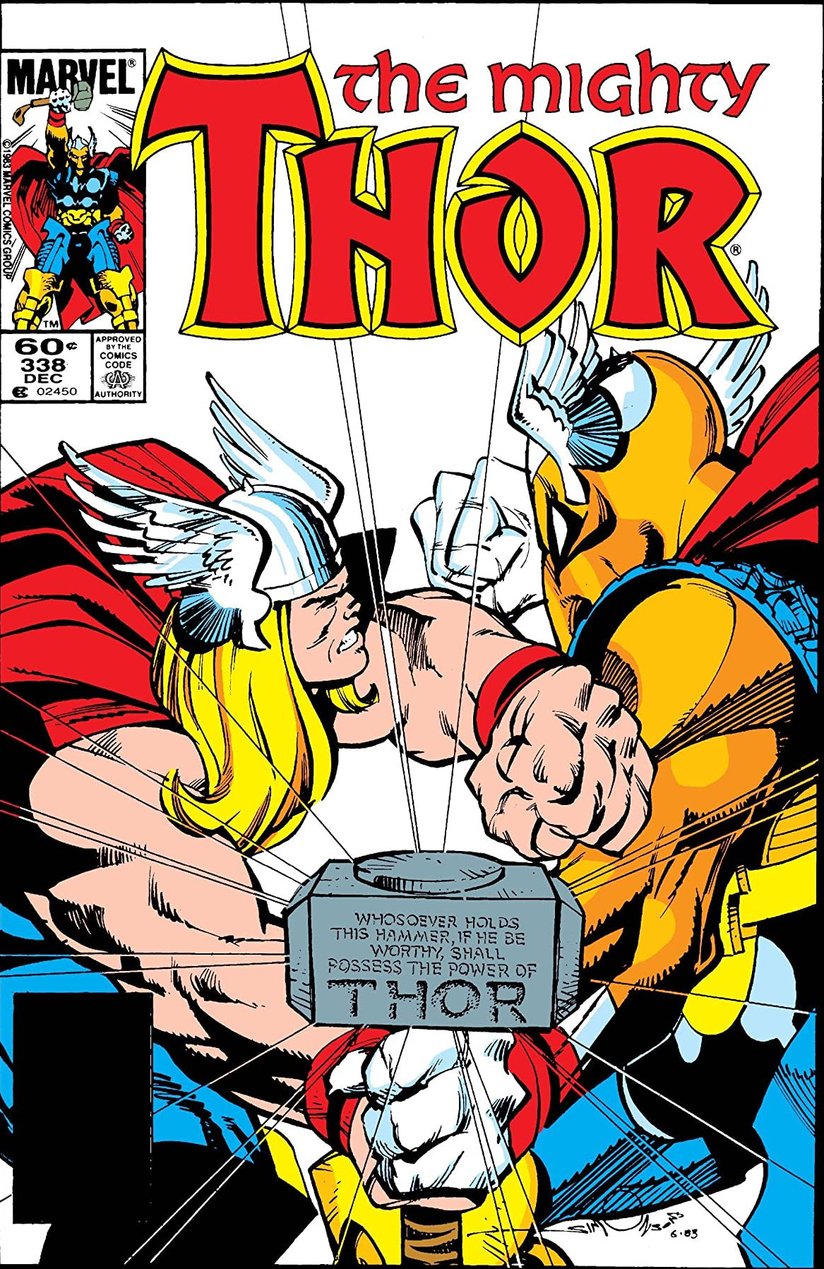 -M |
|
|
|
Post by benday-dot on May 26, 2015 19:34:10 GMT -5
This is the one I always thought was pretty darn spot on: 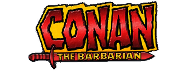 Not too slick, but relates well to a comic about Conan. One of it's successors was pretty sweet too. A little more polished, but very accomplished, and well designed.  |
|
|
|
Post by Action Ace on May 28, 2015 16:55:00 GMT -5
I was reminded yesterday of another good one.  |
|
|
|
Post by Deleted on May 29, 2015 3:48:37 GMT -5
Incredible Hulk Logo I'm a sucker for a logo designed like this - it's classy and embodies the power of the Hulk.
|
|
|
|
Post by Deleted on May 29, 2015 3:58:56 GMT -5
More Favorite Hulk Logos Menacing, Imposing, and I like the concept of the Hulk standing on top of it.  A classic Logo - Bar None! Cartoon Shows - Best Examples  Best of the Best - My 2 favorites here!
|
|
|
|
Post by Ozymandias on Jun 15, 2015 14:13:42 GMT -5
It debuted with Simonson's second issue (#338) 337 showed the old logo being smashed as Beta Ray Bill swung his hammer....  In Spain, we missed Simonson's inspired concept (physically smashing the old logo, to make way for the new one), because we saw this cover instead:  Mariano Ayuso, the editor of this particular Marvel series (along with the Conan titles), totally missed on the brilliance and "fixed" the cover, so it would look more like the rest. |
|