|
|
Post by Deleted on May 17, 2015 1:32:28 GMT -5
If you are a fan of Schnapp's work, Arlen Schumer is giving a talk on his work at an exhibition of his work ...  more info and an overview here-M |
|
|
|
Post by Action Ace on May 17, 2015 16:43:03 GMT -5
my favorites the DC logo from 1976  Action Comics when the comics part got a little smaller, the more recent ones that put Comics into the bottom line are also good  the regular Superman one of course 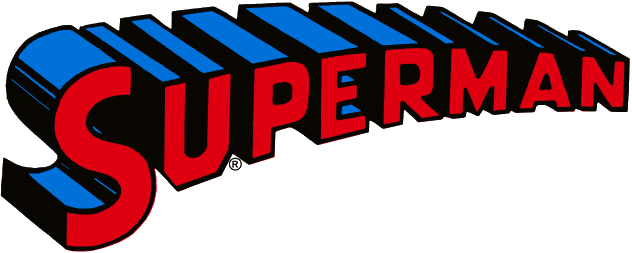 the Justice League of America (the red, white and blue version from issue #138 being the best of them all)  for the JSA, I like the one from last decade and the All-Star Comics one, but this one is my favorite   the Legion is the toughest one to pick, and in an upset I'm going with the one that had the Legion symbol in it 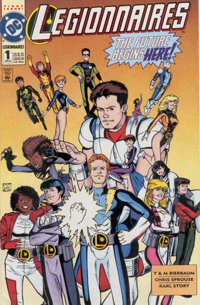 for Batman 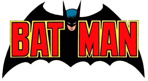 Detective comics is another that's impossible to pick, I'll go with this one 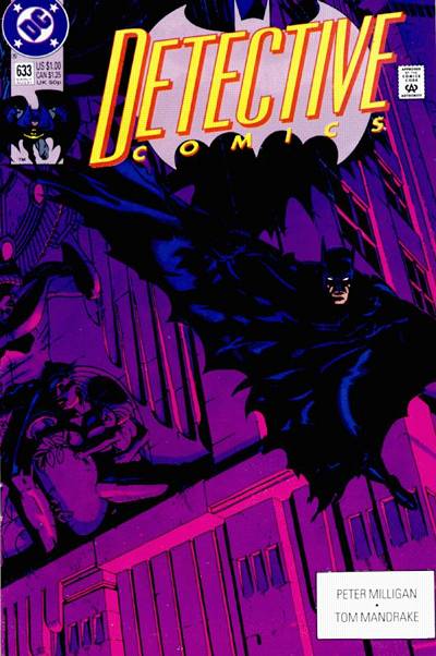 I still call him Captain Marvel, but I like this logo  early speed lines Flash  for Green Lantern  others       (gotta have the rivets!) |
|
|
|
Post by Prince Hal on May 17, 2015 17:27:01 GMT -5
The logo on top in the spotlight is great! As is this one-of-a-kind cover!  |
|
|
|
Post by Prince Hal on May 17, 2015 17:30:45 GMT -5
|
|
|
|
Post by hondobrode on May 17, 2015 23:01:27 GMT -5
|
|
|
|
Post by MWGallaher on May 18, 2015 9:42:28 GMT -5
This somehow came up in a Comics Interview long ago and John Byrne stated, that in his opinion, the ROM logo was the best. Big and bold, clean and simple, and it did it's job. That was such a bold statement, I never forgot it. 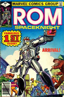 I argued in print with Byrne a bit over logos, and I think he was making that argument then. I contend that Rom did only part of the job of a good logo. It was readable at a glance, yes, even at a great distance, but it conveys nothing about the subject, or about the mood, or about anything that might entice us into buying it. It could just as well have been Courier font, as far as I'm concerned. ROM
SPACEKNIGHT |
|
|
|
Post by MDG on May 18, 2015 11:38:34 GMT -5
I'm a sucker for slab serifs:  My favorite of the several variations:  |
|
|
|
Post by Deleted on May 18, 2015 11:52:55 GMT -5
|
|
|
|
Post by clutterstuffmichael on May 18, 2015 13:39:50 GMT -5
This comic is on my want list simply because of the awesome title interaction...and Steranko.
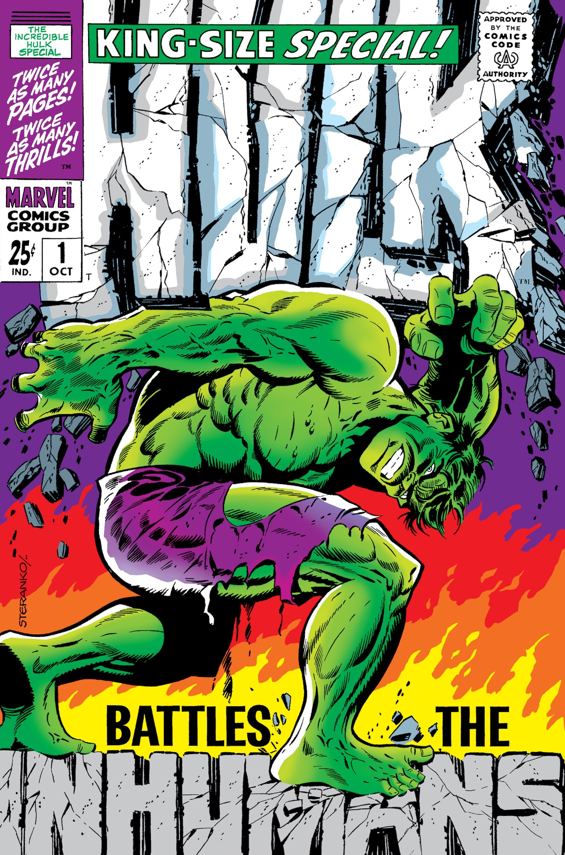
That one is definitely a classic & one of my all-time favorites. It's on my wantlist too, but I actually collect Hulk appearances. (Maybe I ought to double check that I don't already have it, now that I'm thinking about it.) |
|
|
|
Post by Farrar on May 18, 2015 13:55:23 GMT -5
|
|
|
|
Post by Deleted on May 18, 2015 14:36:06 GMT -5
That's a great cover.... -M |
|
|
|
Post by berkley on May 18, 2015 16:12:04 GMT -5
I never really liked this one. Too blocky for me. I much prefer the one just before it:  I wonder if the original Tomb of Dracula logo was partially inspired by that Batman one:  |
|
|
|
Post by MWGallaher on May 18, 2015 17:37:24 GMT -5
This was almost the first comic book I bought. I distinctly remember waiting with my family at the Memphis airport when I saw this comic at one of the newsstands. I was fascinated by the way the vertical and horizontal "Aquaman" mini-logos in the upper left shared their initial letter. This was the first time I had ever noticed that kind of typographical trick, and for some reason, I was just amazed by it. I had no real interest in comic books, but I liked superheroes, and I knew Aquaman from his TV cartoons, but it really was that upper left corner that made me ask my Mom if I could get that comic book. For whatever reason, my usually indulgent mother said "no". It would have been so fitting if my first comic had been an Aparo comic! |
|
|
|
Post by Farrar on May 18, 2015 17:40:42 GMT -5
If you are a fan of Schnapp's work, Arlen Schumer is giving a talk on his work at an exhibition of his work ... more info and an overview here-M Thanks for the link and info, mrp. Looks like a great exhibit. And speaking of Schnapp, I guess this is as good a place as any to post a logo that's pretty ubiquitous   |
|
|
|
Post by Prince Hal on May 18, 2015 20:25:46 GMT -5
We've probably mentioned this one before.  I think that, as with the later Aquaman cover, DC was worried that no one would know what comic they were seeing in the spinner rack or on the newsstand. Thus the comic's name in the corner. I guess the image of Batman right up top wasn't enough for somebody. Of course, to see the word "Batman," you'd have to have damn good eyes. The criss-crossing "Aquaman"s are like overkill by comparison. Similar style with the famous Flash Rogues cover, but at least they kept the Flash logo and made it a decent size.  |
|