|
|
Post by Ozymandias on May 15, 2015 14:53:14 GMT -5
This is probably a separate thread, but I dig it when the logo is incorporated into the art. I second that. In that category, I would mention Hannigan's habit, of taking it to the next level: 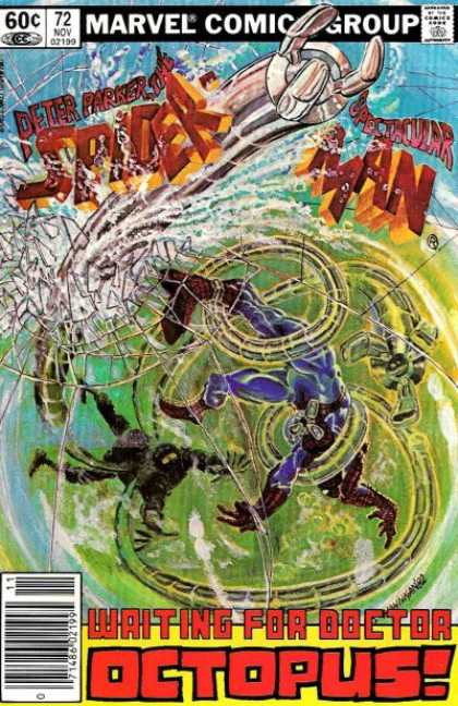 He used to give them physicality, and allow characters to interact with, otherwise static, elements on the cover. |
|
|
|
Post by Prince Hal on May 15, 2015 15:02:23 GMT -5
Two favorites in one... 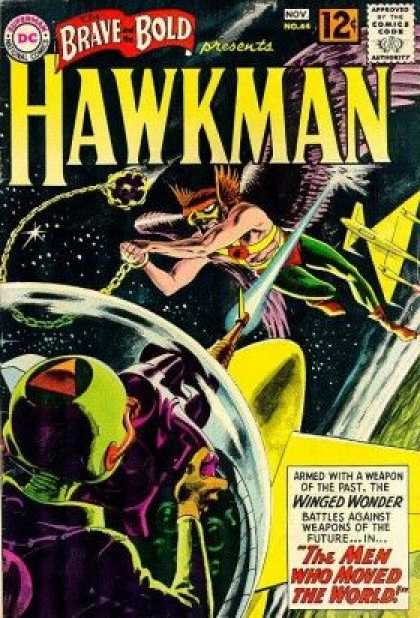 |
|
|
|
Post by Prince Hal on May 15, 2015 15:03:19 GMT -5
A classic... 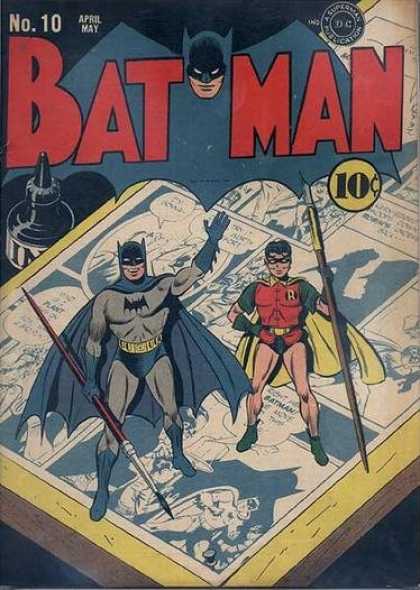 |
|
|
|
Post by Prince Hal on May 15, 2015 15:05:15 GMT -5
Another classic. And a beautiful cover, to boot. Love the coloring of the logo here. Can't recall ever seeing it colored that way again. 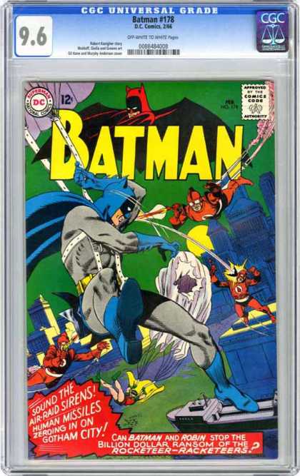 |
|
|
|
Post by Prince Hal on May 15, 2015 15:08:46 GMT -5
Again, a twofer. Love the simplicity and serious style of "Showcase." 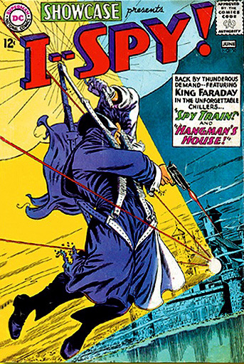 |
|
|
|
Post by Prince Hal on May 15, 2015 15:30:10 GMT -5
Nice close-up  |
|
|
|
Post by Phil Maurice on May 15, 2015 15:57:48 GMT -5
Great idea for a thread. Interesting how so many of these pop even isolated from the cover art.
My favorite:

And one I simply like a lot:
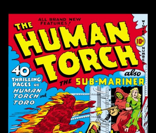
|
|
|
|
Post by pinkfloydsound17 on May 15, 2015 16:15:39 GMT -5
This comic is on my want list simply because of the awesome title interaction...and Steranko.
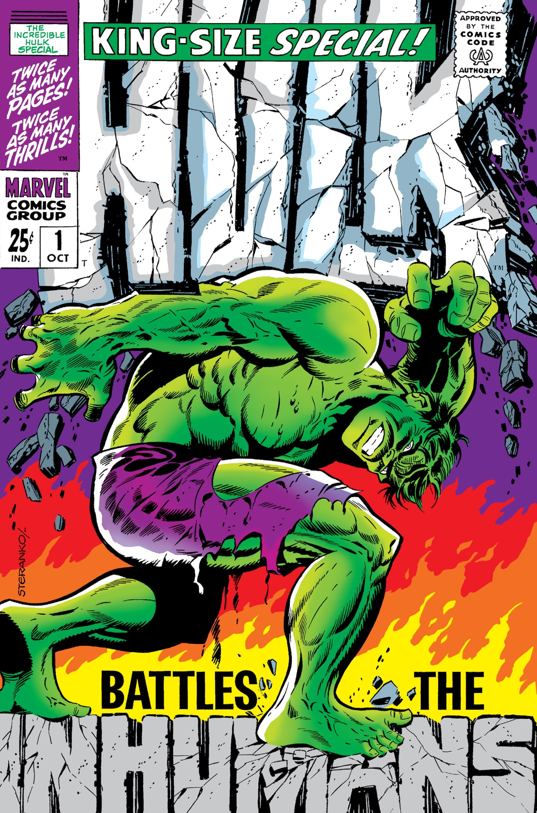
|
|
|
|
Post by Icctrombone on May 15, 2015 17:23:34 GMT -5
Probably my favorite  |
|
|
|
Post by Ozymandias on May 15, 2015 17:31:46 GMT -5
This comic is on my want list simply because of the awesome title interaction...and Steranko.

Thx, I wanted to mention this one (I had it confused with the "tribute", in Incredible Hulk Vol 2 #34). |
|
|
|
Post by Jesse on May 16, 2015 5:26:43 GMT -5
|
|
|
|
Post by MWGallaher on May 16, 2015 6:02:04 GMT -5
It looks good, but it always used to irritate me when one of these cover logos showed Batman wearing the wrong color cowl and cap--red or green for example. Looking back over the covers to Batman itself, it didn't happen nearly as often as I remember, but it did on Brave & Bold: red, green, yellow...even white! Another classic. And a beautiful cover, to boot. Love the coloring of the logo here. Can't recall ever seeing it colored that way again.  |
|
|
|
Post by Prince Hal on May 16, 2015 8:31:31 GMT -5
It looks good, but it always used to irritate me when one of these cover logos showed Batman wearing the wrong color cowl and cap--red or green for example. Looking back over the covers to Batman itself, it didn't happen nearly as often as I remember, but it did on Brave & Bold: red, green, yellow...even white! Another classic. And a beautiful cover, to boot. Love the coloring of the logo here. Can't recall ever seeing it colored that way again.  I was just doing a quick check of Batman issues, and I think your memory is serving you, b/c there were a good number of "batman" logos in other colors. Some I don't care for as much, but the red version (which appeared a few times, more the I'd recalled), I did like. That's what makes horse racing, I guess... |
|
|
|
Post by Deleted on May 16, 2015 9:19:09 GMT -5
Another favorite of mine is the Green Arrow Logo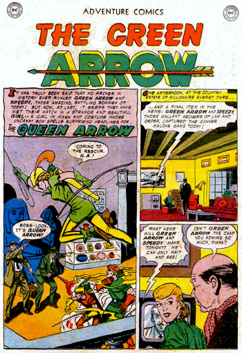 I like the two tone effect here and it's bold and crisp looking. Here's some additional Green Arrow Logos and Black Canary as well. I just dig them too.    |
|
|
|
Post by Prince Hal on May 16, 2015 14:12:44 GMT -5
|
|