|
|
Post by Deleted on Jan 14, 2018 18:16:39 GMT -5
Enjoyed reading the link and thanks for sharing it. Fascinating Stuff! |
|
|
|
Post by Prince Hal on Jan 15, 2018 10:42:25 GMT -5
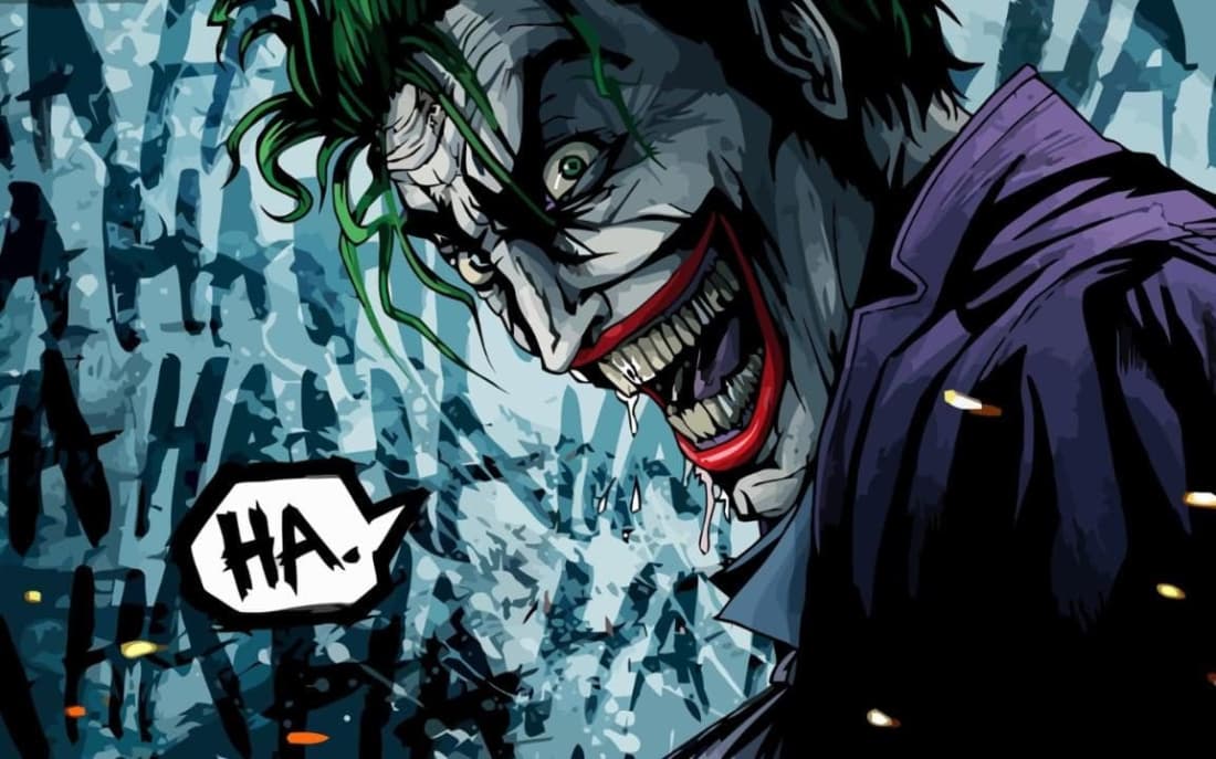
chadwilliam , thanks for the "real-life" Batman cover. I like it more than the actual cover. I know it's "good," but I never felt Adams really caught the subtle madness of the Joker here, as say, Jerry Robinson had. Adams' Joker was closer to the late 60s depiction, all pointed chin and overly large smile. 
|
|
|
|
Post by MDG on Jan 15, 2018 10:53:06 GMT -5
chadwilliam , thanks for the "real-life" Batman cover. I like it more than the actual cover. I know it's "good," but I never felt Adams really caught the subtle madness of the Joker here, as say, Jerry Robinson had. Adams' Joker was closer to the late 60s depiction, all pointed chin and overly large smile.  Agreed--Adams seemed to set the character on a path where his jaw became so long (and pointed) that it stopped making anatomic sense and artists compensated by making his teeth weirdly long.   Rogers did a good job keeping it in check.  |
|
|
|
Post by chadwilliam on Jan 15, 2018 11:46:23 GMT -5
As a kid, I assumed that the acid which turned his face white and hair green also elongated The Joker's chin. It does work for me sometimes but I would have preferred it if artists had used the original Joker as their go to model.
I read an interview with Neal Adams a while back in which he stated, matter-of-factly, that The Joker was physically incapable of not smiling. Of course, this isn't the case (and I can think of at least one panel from 'Five Way Revenge' where the Joker isn't grinning) but it makes me wonder if that isn't why artists go overboard with the unnatural look for the character - if others are under the same misconception that The Joker must always carry a broad grin on his face, then perhaps that's why his head is so abnormally large.
|
|
|
|
Post by chadwilliam on Jan 15, 2018 11:48:37 GMT -5
Rogers did a good job keeping it in check.  And speaking of swipes...  |
|
|
|
Post by lobsterjohnson on Jan 15, 2018 12:35:29 GMT -5
Rogers did a good job keeping it in check.  And speaking of swipes...  Jeez. That is nightmarish. |
|
|
|
Post by Prince Hal on Jan 15, 2018 13:02:54 GMT -5
Do you remember this late 1961 character, Mr. Sardonicus... (Somebody loved the Joker)  |
|
Confessor
CCF Mod Squad
Not Bucky O'Hare!
Posts: 10,220 
|
Post by Confessor on Jan 15, 2018 22:47:05 GMT -5
For what it's worth, I much prefer the Neal Adams version of the Joker to the earlier Golden Age one -- elongated chin and huge teeth and all. That's the way I like the Joker drawn by subsequent artists too, such as Brian Bolland. I even picked this version of the Joker a few weeks back as one of my entries in the Classic Comics Christmas. Oh, and like you chadwilliam, I always assumed that the elongated face was a side effect of the acid that the Joker fell in. |
|
|
|
Post by chadwilliam on Jan 15, 2018 23:23:04 GMT -5
Do you remember this late 1961 character, Mr. Sardonicus... (Somebody loved the Joker)  Probably my favorite William Castle picture! |
|
|
|
Post by tarkintino on Jan 16, 2018 12:50:46 GMT -5
Do you remember this late 1961 character, Mr. Sardonicus... (Somebody loved the Joker)  Great character, and here's Basil Gogos' memorable Famous Monsters of Filmland cover featuring Sardonicus:  |
|
|
|
Post by Prince Hal on Jan 18, 2018 10:52:15 GMT -5
|
|
|
|
Post by Icctrombone on Jan 18, 2018 11:25:08 GMT -5
|
|
|
|
Post by berkley on Jan 18, 2018 12:04:02 GMT -5
I know a lot of people will disagree but the contrast between the Kirby Thor and Alex Ross Superman covers brings out a lot of what I find so great about Kirby's style as opposed to some of the more realistic superhero artists. The Ross cover has none of the force and energy of Kirby's to me, and the bulging biceps of his Superman and adversary don't convey anything like the sense of strength that comes through in Kirby's Thor and Hercules.
Mind you, I can't help wondering how much background detail Vince Coletta erased from Kirby's original, if any.
|
|
|
|
Post by Icctrombone on Jan 18, 2018 15:43:16 GMT -5
Mind you, I can't help wondering how much background detail Vince Coletta erased from Kirby's original, if any. I can't imagine any more detail making the cover better. Less is More. |
|
|
|
Post by Prince Hal on Jan 18, 2018 16:18:18 GMT -5
Mind you, I can't help wondering how much background detail Vince Coletta erased from Kirby's original, if any. I can't imagine any more detail making the cover better. Less is More. Just one detail... having almost anyone but Colletta ink it.  |
|