|
|
Post by Icctrombone on Oct 21, 2016 5:45:44 GMT -5
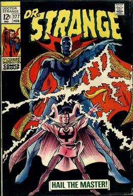
Stephen Strange's costume evolutions...  What were they thinking when they gave him this look? It's like they tried to give him a generic superhero look. |
|
|
|
Post by adamwarlock2099 on Oct 21, 2016 6:42:29 GMT -5
I agree with Juggernaut on Captain Marvel as far as the costume. But I did like the more cosmic space age suit he had in the series Peter David wrote in 2002: imgur.com/a/C9ObN |
|
Confessor
CCF Mod Squad
Not Bucky O'Hare!
Posts: 10,222  Member is Online
|
Post by Confessor on Oct 21, 2016 6:59:11 GMT -5
  How could you NOT like the alien costume better? Better? You think the black costume is better than the original red & blues? Wow...I mean, just...wow. There's no accounting for taste, I guess. I mean, I really like the alien costume too but, no way would I say it was better than the original. |
|
|
|
Post by Deleted on Oct 21, 2016 7:19:46 GMT -5
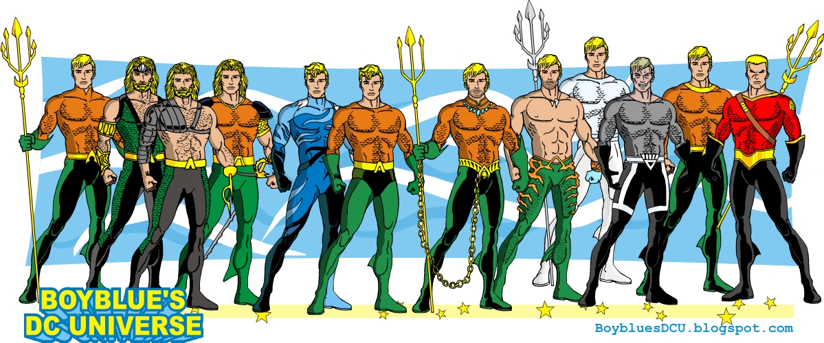
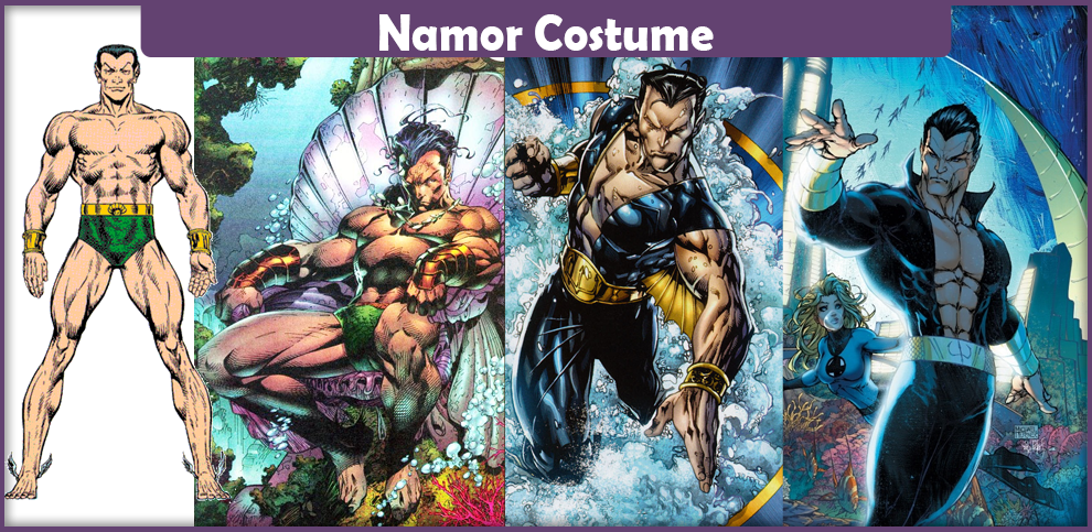
 I forgot Aquaman has had many different looks over the years. I like his original & his blue costume the best.  I like Namor in the black costume. Never was crazy about the speedo... |
|
|
|
Post by brutalis on Oct 21, 2016 7:26:58 GMT -5
Liked Hank Pym Goliath when his suit was blue and gold.
Original Wonderman in green and red with goggles all the way. The Perez redesign gets much hate: but i think what is mostly wrong with it is the coloring scheme. Flip the red to green and green to red and darken them both to original color scheme and widen the chest diamond and making all the yellow trim as smaller with a wide yellow around the shoulder and replace wrist bands and boots with his original's and then it wouldn't be so bad. Safari Jacket Wonderman can be lost forever as far as i am concerned.
Loved both Captain Marvel outfits, the original uniform and then the red/blue hero.
The black Spider symbiotic suit was okay if overly simplified design and just not handled very well and not really suits the Peter Parker Spider-man tone.
Wasp in her original and then the kind of standard yellow/red during the Byrne year's suited her. But as noted, part of the charm of Jan is in her constant costume designing changing with the times and styles.
Liked Pietro's Quicksilver change from the green to the light blue and silver/white. much more dignified and resembling of his name.
While Namor would likely be most comfortable in his trunks alone, the change into the blue suit with golden underarm wings was very much needed improvement i thought for a monarch and parading around New York.
Batman adding the oval bat insignia in the 60's was iconic and lasted a very long time before reverting to just a big black bat on the chest.
Any Dave Cockrum Legion of Super-heroes redesign was pretty much spectacular improvements over the original designs.
The Neal Adam's Green Arrow update to a more 70's Robin Hood archer was great and improved upon even more so by Mike Grell when taking Arrow full on into the Robin Hood styling.
Daredevil from the Black and Yellow to the full Red horn Head we all know and love is perfection.
Iron Man classic sleek and simple Red and Gold armor held up through the decades and now he looks more machine than man. It was great even when they began specializing different armor depending on the needs. Those were very cool temporary changes or additions to the classic.
Falcon from the green into the Red and White with and without wings was singularly 70's but so suited the character and ever since every outfit lacks something. They can't recapture that original sleek disco styling no matter how they try.
So much more to come...
|
|
|
|
Post by adamwarlock2099 on Oct 21, 2016 7:59:04 GMT -5
Always liked the black bat over the oval. The darker Batman looks the better. That way he looks scary instead of having to turn him into a psychopath to make him scary.
|
|
|
|
Post by tingramretro on Oct 21, 2016 8:00:04 GMT -5
If you are going to include Wonder man, though, you need this one:  What was George Perez thinking? That is actually my favourite Wonder Man costume. |
|
|
|
Post by tingramretro on Oct 21, 2016 8:12:17 GMT -5
|
|
|
|
Post by tingramretro on Oct 21, 2016 8:35:30 GMT -5
|
|
|
|
Post by tingramretro on Oct 21, 2016 9:04:33 GMT -5
Peter Cannon, Thunderbolt...  ...adopted this monstrosity in the pages of Justice League Europe (right before DC lost the rights to him)...  |
|
|
|
Post by tingramretro on Oct 21, 2016 9:20:34 GMT -5
Alan (Green Lantern) Scott's early 90s costume, which I actually prefer to his original.  |
|
|
|
Post by tingramretro on Oct 21, 2016 9:31:19 GMT -5
I'm also surprised nobody has yet mentioned serial costume killer Warren Worthington III, AKA the Indecisive Angel...     Just a small sampling of his many costumes: the one at the bottom, a variant on the Neal Adams design lacking a chest symbol, was actually only ever seen in the first issue of The Official Handbook of the Marvel Universe Deluxe Edition in 1985; it was apparently intended to be a new design for the then upcoming X-Factor series, and the rest of the team would have been similarly garbed, as the following issue's Cyclops entry showed. The design was changed before the new book went to print.  |
|
shaxper
CCF Site Custodian
Posts: 22,878
|
Post by shaxper on Oct 21, 2016 9:38:30 GMT -5
  How could you NOT like the alien costume better? Better? You think the black costume is better than the original red & blues? Wow...I mean, just...wow. There's no accounting for taste, I guess. I mean, I really like the alien costume too but, no way would I say it was better than the original. It's far more spider-like, better emphasizes the eyes, and it's pretty much the strongest color contrast possible. Enigmatic, mysterious, striking. |
|
|
|
Post by tingramretro on Oct 21, 2016 9:40:23 GMT -5
Another aborted Cyclops design from the same issue of OHMTU as the previous one.  |
|
|
|
Post by tingramretro on Oct 21, 2016 9:46:32 GMT -5
Hawkeye strikes a blow for sexual equality in the early 1970s by proving that not only women can wear miniskirts to work...  |
|