|
|
Post by Deleted on Feb 9, 2018 17:59:47 GMT -5
Tomorrow, it will be a blockbuster threesome of logos that I've liked and very similar and yet quite different and it's going to take me 2 posts to cover these three logos together. 2 from Marvel and 1 from DC Comics. I'll work that in the afternoon and need time to think about it. I'm trying to get as many I can until March 1st.
|
|
|
|
Post by Deleted on Feb 9, 2018 18:53:02 GMT -5
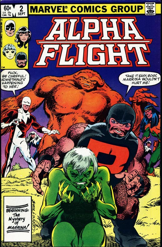
Number 100 Alpha Flight From Marvel Comics Alpha Flight From Marvel Comics When you are working with a list of 200 logos that I've seen in my lifetime and there is one blasted LOGO gets in the way and I've made an ERROR ON MY PART making this one at Number 72, and in reality its should been 100 and my Black Lightning Logo should had been #99 and every other logo on this countdown move up one single notch! I just had to get this horrible error on my part when you deal with the list of this size. I used to 50 list and this is 4 times the trouble and having said that ... I regretted this error because its looks like a College Logo and they used a College-Themed Lettering that doesn't look good to me after seeing so many times on my list and somehow ... its gets overlooked and I'm very embarrassed to put this at Number 72. The problem is that I loved Alpha Flight because its contains two cool characters Vindicator and Sasquatch and the rest of the team fit in quite nicely indeed.  The problem with this logo - if looked from the Distance it is a horrible mess to begin with and more that I've think about its should be in the list of 50 rejects that I started out in the first place. This is the best one that I've seen and I'm frustrated that I didn't catch this in the first place and frankly mad at myself for not checking it one more time after my last post on this thread. The colors are nice but the design and the mess of it ... isn't all that good. Anyway, I just wants this out of the way and I know that all of you wonder what in the world ... that Number 100 came up twice on this thread! Because of my error of not seeing the reality of this logo and awful mess it is - seeing the letters all close together and that white line separating the Alpha and the Flight made it even worse. Sorry Members ... my glaring error on my part! |
|
|
|
Post by dbutler69 on Feb 10, 2018 6:19:06 GMT -5
The Alpha Flight logo is OK, and I used to love the comic itself until John Byrne left. Then it fell of a cliff.
|
|
|
|
Post by Deleted on Feb 10, 2018 16:41:02 GMT -5
Number 71 Squadron Supreme From Marvel Comics Squadron Supreme From Marvel Comics Personally, I never really embraced this group ... but, it's had a very attractive logo here and I've to admit it's a classic design and notably pleasant to the eye ... it's has that eye-candy appeal and the lettering is a good way of looking at it. I just felt it's a plain and glorious logo that's will always be on someone minds and I just having a hard time ranking it higher because ... I detest the letter "Q" and it's would be better if they got rid of that triangle in the center and left it alone and that's would had been a cleaner and more effective logo. The colors are nice, decent, and very nicely arranged and that's makes it a winner at Number 71.  I prefer the original costumes over this ... and I don't recognize this logo below because if you have limited run of books, 20 or less ... the logo that they use for this group is invalid and I don't accept it all. Sorry. I'm covering all my bases here and to me, the life of the logo is very important to me. This logo is not in my list of 50 rejects too.  |
|
|
|
Post by Deleted on Feb 10, 2018 17:06:33 GMT -5
Number 70   Legion of Super Heroes From DC Comics Legion of Super Heroes From DC Comics Just for the record, the bottom two logos aren't in my 50 rejects files and I have to include all three of these logos together and I really prefer the one on top the best of the three shown here. The bottom one is a classic logo and I felt it's has too many letters and really doesn't look good on a comic book cover at all. The one on top of that logo is a bold and dynamic one indeed and the problem is that this logo is a stackable logo and I just care for that one at all.  What made this logo shines is the words "Legion" and "Of" are done just nicely and they did a bang up job and finding the right lettering style to make it work. I loved all three of these logos and the one on top is the best of the three logos because they finally found one that's works for me just right. The one in the White and the Red on top is the best of three that I've showed you today. Lots of history here and they have their share of logos and I just wished that they had a shorter name and that's why I liked the top one so well and works just perfect for me and everyone that came across it. Note: The word "Starring" on the bottom logo here is a no-no in my book ... |
|
|
|
Post by tarkintino on Feb 10, 2018 20:56:59 GMT -5
 Legion of Super Heroes From DC Comics Legion of Super Heroes From DC ComicsThis was my favorite logo, during the title's greatest period. Personally never had a problem with "starring", as it was merely making a distinction that they were the feature story in Superboy's title. |
|
|
|
Post by Deleted on Feb 10, 2018 23:41:21 GMT -5
 Legion of Super Heroes From DC Comics Legion of Super Heroes From DC ComicsThis was my favorite logo, during the title's greatest period. Personally never had a problem with "starring", as it was merely making a distinction that they were the feature story in Superboy's title. I understand that, but ... I felt it out of place and I wished they hadn't done that ... but your point that it is a feature story in Superboy's life and you've centered on that point and I've wanted to say thanks for put the emphasis on that alone. Good call on your part!  |
|
|
|
Post by Deleted on Feb 11, 2018 0:09:24 GMT -5
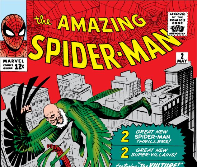
Number 69 Amazing Spider-Man From Marvel Comics Amazing Spider-Man From Marvel Comics This may surprise some of you here ... the best feature of this logo is the fact that they actually incorporate spider-web into the design and they did it very nicely indeed. The word "the" on top is hardly noticeable until you look at close and in your hands when you go to your LCS back then and that the beauty of this logo so that you are focusing on the part of "Amazing" and "Spider-Man" in this very distinctive and stylish logo. You just can't go wrong with this one ... and by the way, this is one of my favorite Spider-Man stories that I read many years ago.  The problem with this is that this is a basically a one color logo and rightly so and it's a classic one and I've wished I rate it higher. I have others that are better and I'm kind of sad placing it at Number 69.  But, the one that I chose is far better than this one in the yellow and the red here and it's so bad ... I just can't stand the lettering in Yellow on the bottom of all letters that spells "Spider-Man" because of the jagged spikes or whatever you've may call it. The only thing is good about it is the red part of the logo ... There is one other Spider-Man logo is better than these two and it's a classic and that's coming up on a later date. |
|
|
|
Post by chadwilliam on Feb 11, 2018 0:52:40 GMT -5
I love how the logo gets progressively larger as you go from 'the' to 'Amazing' to 'SPIDER-MAN' and how it takes up such a large chunk of the cover. I can't suppose that they could have kept it up forever though since doing so would have meant forcing the artist to reduce his artwork to fit a smaller space. Sure enough, with the second issue, the logo from the first issue was re-positioned to something more manageable (and still great)  I hope I'm not straying too far off course with this additional bit of trivia Mecha, but I believe that this second issue not only features the debut of the more familiar Spider-Man logo, but also the first time a corner box appeared on the cover of any comic book. From my own experience of having once worked in a bookstore, I know that magazines are fitted onto a shelf with so many other periodicals that oftentimes, all you can see of a particular title is the top left hand corner since the magazines on the shelves beneath it obscure the bottom half of the cover while the magazines to the right overlap the issues to their immediate left leaving the right side of the magazine blocked from view. I suspect that Ditko's idea to have that corner box featuring Spider-Man's head there was due to this problem. I will say that as much as I love the logo on Amazing Spider-Man 1, I think Ditko did an even better job with the webs on the second issue here. |
|
|
|
Post by Deleted on Feb 11, 2018 2:46:55 GMT -5
I love how the logo gets progressively larger as you go from 'the' to 'Amazing' to 'SPIDER-MAN' and how it takes up such a large chunk of the cover. I can't suppose that they could have kept it up forever though since doing so would have meant forcing the artist to reduce his artwork to fit a smaller space. Sure enough, with the second issue, the logo from the first issue was re-positioned to something more manageable (and still great)  I hope I'm not straying too far off course with this additional bit of trivia Mecha, but I believe that this second issue not only features the debut of the more familiar Spider-Man logo, but also the first time a corner box appeared on the cover of any comic book. From my own experience of having once worked in a bookstore, I know that magazines are fitted onto a shelf with so many other periodicals that oftentimes, all you can see of a particular title is the top left hand corner since the magazines on the shelves beneath it obscure the bottom half of the cover while the magazines to the right overlap the issues to their immediate left leaving the right side of the magazine blocked from view. I suspect that Ditko's idea to have that corner box featuring Spider-Man's head there was due to this problem. I will say that as much as I love the logo on Amazing Spider-Man 1, I think Ditko did an even better job with the webs on the second issue here. Thanks for sharing that part in bold and I totally was unaware of that and I appreciate the fact that you've mentioned it in the first place and all that. Your comments is most grateful and thanks for sharing them. |
|
|
|
Post by tarkintino on Feb 11, 2018 5:54:23 GMT -5
I hope I'm not straying too far off course with this additional bit of trivia Mecha, but I believe that this second issue not only features the debut of the more familiar Spider-Man logo, but also the first time a corner box appeared on the cover of any comic book. From my own experience of having once worked in a bookstore, I know that magazines are fitted onto a shelf with so many other periodicals that oftentimes, all you can see of a particular title is the top left hand corner since the magazines on the shelves beneath it obscure the bottom half of the cover while the magazines to the right overlap the issues to their immediate left leaving the right side of the magazine blocked from view. I suspect that Ditko's idea to have that corner box featuring Spider-Man's head there was due to this problem. . Great point. This marketing tool was also the reason for upper edge banners and character corner symbols on comics, as they were either inserted in spinner racks where only the aforementioned upper edge would be seen, or laid out in rows on newsstands, where only the title area would be exposed. This explains DC's use of "go-go" checks in the mid 1960s, Gold Key using familiar actors' pictures in a box at the top of their TV/movie adaptations, and the flood of Marvel & DC character corner symbols so much--especially from the 60s to the early 90s. Even Warren used the layout by having striking head or character body vignettes in the corners of Famous Monsters of Filmland, Eerie, Creepy and Vampirella, among other titles. |
|
|
|
Post by Deleted on Feb 11, 2018 10:43:27 GMT -5
Number 68 Deadman From DC Comics Deadman From DC Comics Notes: I didn't read many Deadman titles and wasn't really into this character at all until Justice League Dark in the 2000's and having said that ... I just loved this logo on top. I've very little exposure and very little knowledge of him at all. I've just wanted to get this off my chest for you. Here's two covers that I've wanted to show you the impact of this logo did for me.   What's makes it so cool is the Letter "D" with his head inside of it and that wicked Gothic Style Lettering (can't think the right word here) ... but it's so good and I wished that I could rate it higher ... the colors and the graphics is spot on and I just find it a natural logo for this character of what I know of him in a very limited way possible. I'm more familiar of him in Strange Adventures than today and I knew of him in Justice League Dark and all that and ... I still don't know much about him and that's why I'm having a hard time remembering it. But, this logo makes a statement and rightly so. I find it very noticeable and iconic at the same time. I like the red best and surprisingly ... Yellow works too and that's a no-brainer for me alone. So, Deadman at Number 68 and the coolest thing about that logo ... that his head is inside the letter "D" and you don't see many of them these days and that's why I like about it and ... that's makes it one of the rarest logo in comic book history. |
|
|
|
Post by dbutler69 on Feb 11, 2018 13:04:44 GMT -5
I love the Legion of Super-Heroes logo, such at the one in LOSH #263 above. It's a classic, very stylish.
I like the Amazing-Spider-Man logo. They're both good, but I like the one from #1 a little better. Very cool how they incorporated the spider web into it.
The Deadman logo is cool and appropriate for the character.
|
|
|
|
Post by Deleted on Feb 12, 2018 4:45:17 GMT -5
Number 67  Justice League Detroit From DC Comics Justice League Detroit From DC Comics First of three JLA Logos to appear on this thread and I've liked this logo for it's modern looks and kept some of the classic sense too. It's not the greatest of all Justice League logos and I'm impartial to this one for it's hip and definately a decent logo to look at. The one on top is my favorite Justice League Detroit Logo and I'm not much of a fan of this group at all and I do appreciate their logos as well.  I love the colors and the block style of the lettering and all that. It's bold, crisp, and clean logo to look at and it's unmistakably genuine and downright unique to look at. The word "Of" is very well centered and I like the letter "f" in it. The letter "o" is very unusually shaped and combined the two to create the word "Of" is the best part of the logo itself and that's why I had this logo at this spot on Number 67. It's also have that retro feel to it and that's the beauty of this logo too. |
|
|
|
Post by Deleted on Feb 12, 2018 4:49:03 GMT -5
My next JLA Logo will appear in Number 32 and that time that logo and six others will appear and they are all equally ranked at Number 32.
|
|