|
|
Post by dbutler69 on Feb 16, 2018 15:06:54 GMT -5
Quasar is pretty good. The blocky style is nothing special, but I do like how the line from the "Q" goes under the rest of the logo.
Good luck with your personal business.
|
|
|
|
Post by Deleted on Feb 16, 2018 17:34:51 GMT -5
Quasar is pretty good. The blocky style is nothing special, but I do like how the line from the "Q" goes under the rest of the logo. Good luck with your personal business. Thanks ...  |
|
|
|
Post by Deleted on Feb 18, 2018 14:29:07 GMT -5
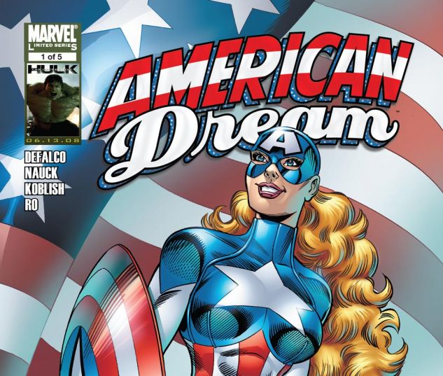
Number 53  American Dream From Marvel Comics American Dream From Marvel Comics I know that some of you will come to a shock seeing this logo at Number 53 and reason for this logo that it is a nice clean flowing logo that really grabs you (figure of speech here) and it's very bold and not much of a clutter as you might see here and there. I liked the used of Blue outlining the logo itself and the fact reminds it's not a predominate color at all - but an enhancing color too. It's really there to emphasis that and that the reason that I've like this logo very well. The other two reasons are: The word American is done in red and white. (Reason One) The word Dream is done in white only. (Reason Two) Combined those reasons ... you got yourself an unique logo to look at and it's really works well for this character alone. That's the main reason that I loved this logo!  |
|
|
|
Post by Deleted on Feb 18, 2018 20:35:18 GMT -5
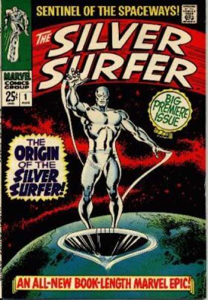
Number 52  Silver Surfer From Marvel Comics Silver Surfer From Marvel Comics For all the Silver Surfer Logos - this one is only one that I've liked and the reasons for that is the color, the curves of the letter looking like a two-way surfboard like and most of all it's clean, bold, and very original. You can spot it a distance away and know the book instantly. Very recognizable and respectful. The words "Sentinel of the Spaceways!" ... in Yellow, in my mind is from my part is not part of it and yet most people that I've talked to it is. So, having said that ... I have to consider it a part of the LOGO and with that alone its makes it whole; but in my mind it's a separate thing and having to deal with it and knowing that - I have to say this it's in Yellow and that alone ... make it a Gold and Silver thing and that's a cool combination to have in this iconic logo that I just shared with you. In short, it's simple and bold at the same time!  |
|
|
|
Post by Deleted on Feb 18, 2018 20:55:49 GMT -5
American Dream surprised me. I LOVED the MC2 universe.
|
|
|
|
Post by dbutler69 on Feb 19, 2018 8:56:41 GMT -5
I've never, ever heard of American Dream, but it's a pretty nice logo.
Silver Surfer is a solid, if unspectacular, logo.
|
|
|
|
Post by Deleted on Feb 19, 2018 14:42:34 GMT -5
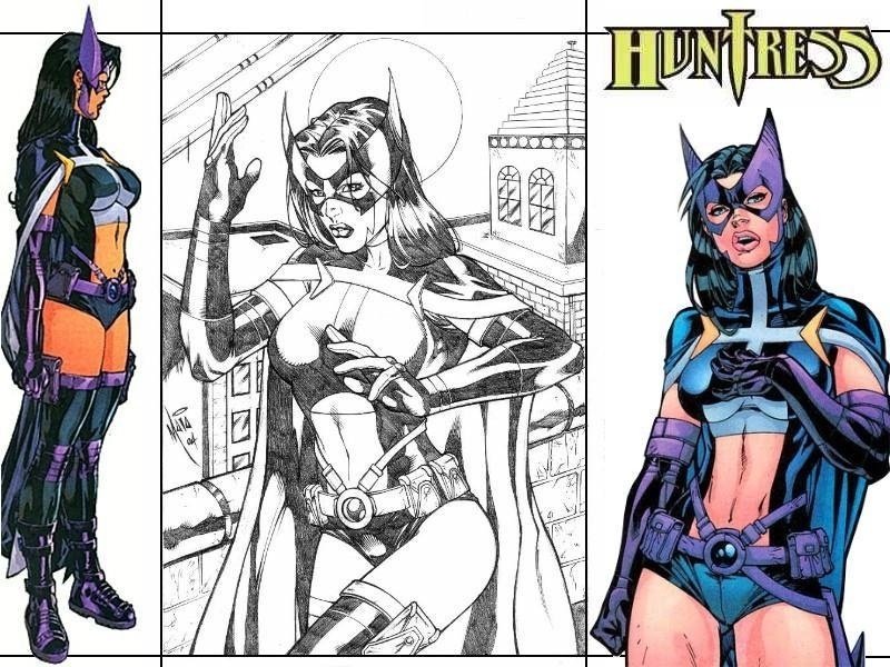
Number 51 Huntress From DC Comics Huntress From DC Comics This is one of neatest logo around and very unique that I may add here.  Loved the "T" that was that use a dagger/knife as a letter is very cool and the two "S" at the end is very different and radical one indeed. This is one of my favorite in terms of how it's laid out and the "H" has that snappy boldness ring to it. That's my favorite part of it and that's the beauty of it. Loved all the colors that they used for that logo and it's universally acceptable in my book. I wished that I could rate it higher but I've can't  Cool Pictures of the Huntress here; unfortunately ... the logo below you with Helena Wayne Huntress is not a good one because the word "The" and the main body with the "ess" at the end is not my favorite part of that logo and the ugly way they shaped the "n" is the most lamest way they could do it.  I couldn't put this logo in my 50 rejects and I just don't know what DC Comics were thinking then. Sorry Everyone. |
|
|
|
Post by Deleted on Feb 19, 2018 14:45:28 GMT -5
md62 and dbutler69 ... thanks for your comments and those were valid I've may add here. Special Note Starting tomorrow ... with what?
|
|
|
|
Post by Deleted on Feb 19, 2018 19:39:12 GMT -5
Number 50 Wonder Woman From DC Comics Wonder Woman From DC Comics This is my favorite Wonder Woman Logo from the Comic Books - the reason the bold lettering, the Star on the left side of Woman, and most importantly the crispness and the dynamic of it - the Letter "W" is the best part of that logo and having said that ... it's really stands out. Both Black and White Colors are clearly shown here and that's further enhance the logo itself and that's why I like the contrast of these two colors here. I've might have surprised some of you here and that's whole aspect of this stunning logo that brings to the table. Powerful Presence of Red and Yellow followed by the sharp contrasting borders of white and black brings an unique logo for this popular DC Comics character. Works great in this format below too ... it's universally acceptable in any color they choose in any cover of Wonder Woman Wonder Woman #600 has an introductory from Lynda Carter - and that's one of my favorite issue of all time. |
|
|
|
Post by dbutler69 on Feb 20, 2018 16:30:20 GMT -5
That is a pretty snazzy Wonder Woman logo, though I've never seen it before. I love the red & yellow color combination. It gets me every time.
|
|
|
|
Post by Deleted on Feb 20, 2018 16:46:37 GMT -5
Number 49 Mighty Thor From Marvel Comics Mighty Thor From Marvel Comics%20021-000.jpg) This is my most favorite Thor Logo of all time! The main reasons is the "O" and the "H" in Thor that's cemented it to greatness and that's the number one selling point of this logo and everything else just blends in very nicely. The word "Mighty" is done just right and its harmonize the logo to perfection. The lettering style is very original and very unique. It's one of my favorite design for a lady Thor that Marvel done very recent. The "T" and "R" done here is excellent and the logo all together spells out just right on the nose. The Hammer in the "O" and the "H" is totally radical, neat, original, and most of all ... it's incredible to see that and that's why I love this logo. The Secondary Colors in all of these logos is the weakest part of the logo and that's why it's at Number 49 on my countdown. Except in certain covers like the one above you and the one below you it is.  This is one cool logo! |
|
|
|
Post by Deleted on Feb 21, 2018 4:32:57 GMT -5
Number 48 Plastic Man From DC Comics Plastic Man From DC Comics This is a very neat logo with an appeal that's attracts my attention when I see it and it's a no-nonsense plain good ole fashioned logo with an attitude that's tells me that this logo so cool and refreshing at the same time. It's bold, has great character, and most of all ... it's really embraced the character ... Plastic Man quite well. You just can't go wrong with it and I just love the design and the black background and that red fits quite nicely in this original logo that captured the spirit of this wacky character below. It's a fun logo and l loved it anyway!!!  Here's a couple of covers that's embraced this character quite nicely ...  Red is the best of the best ... Yellow works just as well and to me it's really makes the cover "Pop!" here ...  |
|
|
|
Post by Deleted on Feb 21, 2018 8:45:35 GMT -5
Regarding Plastic Man, my comments (of what I've written) was the toughest comments that I've ever written so far and yet alone for some unknown reasons this logo is a favorite of mine for years. I've just can't find the right words for this logo and I loved the dynamics of it. It's not an easy thing to do here and I've been thinking about it for some time. I just wanted to get this off my chest for now. 
|
|
|
|
Post by Deleted on Feb 21, 2018 9:13:07 GMT -5
Number 47 Wolverine From Marvel Comics Wolverine From Marvel Comics This is one of the most jazziest logos around and really pops on the Cover and most importantly, this is an iconic logo that will endure for a very long time. It's perfect for this character and really stands out just right.  The logo in any form of all ... works great with any of the Wolverine Costumes and Design. I believe that Marvel Comics did an excellent job of creating it and most importantly ... its adds class to it and style all the same time here.  I've totally forgot the boldness of the White and Blue Border Logo here and it's a classic indeed and really stands out in the crowd; while the logo on the bottom with the Yellow and Red here is a winner in my own judgment and I find these logos really stands out. Everything about these logos is the facts - remains here is the letter "E" and "W" along with "V" letters here are the main reasons that I loved this logo. The rest of the logo itself is a gem itself and having said that ... that this logo is very original and perfect for this iconic X-Men and Canadian Superhero that one of the most popular of all time.  Wolverine is a winner in my book! |
|
|
|
Post by hondobrode on Feb 21, 2018 9:25:34 GMT -5
Haven't followed Marvel for years now, but I like that new Thor logo.
Also, the pointed-ness of the Wolverine logo works really well for the character.
|
|