|
|
Post by pinkfloydsound17 on Feb 21, 2018 12:13:42 GMT -5
Agreed^
I also like the 3-D aspect...I wonder what it would look like without that?
|
|
|
|
Post by dbutler69 on Feb 21, 2018 14:54:59 GMT -5
The Thor logo is clever.
The Plastic Man and Wolverine logos are good, solid logos.
|
|
|
|
Post by chadwilliam on Feb 21, 2018 18:12:47 GMT -5
That Thor logo makes so much sense that I'm surprised no one thought of it before.
|
|
|
|
Post by Deleted on Feb 21, 2018 19:05:55 GMT -5
The Thor Logo was contributed to my dear friend Tom who helped me with this project and I find it to be very original and unique.
|
|
|
|
Post by Deleted on Feb 21, 2018 21:14:29 GMT -5
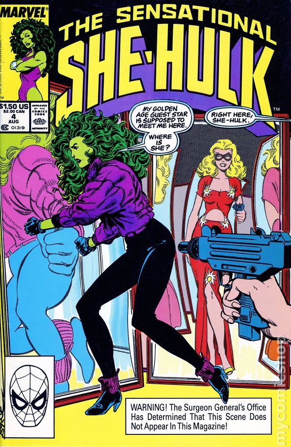
Number 46 The Sensational She-Hulk From Marvel Comics The Sensational She-Hulk From Marvel Comics This is my last She-Hulk Logo and it's a fantastic simple logo that's grabs your attention; because of the curves of the letters and the style of the Logo itself. The words ... "The" and "Sensational" are the highlights of this great logo and it's enhanced the words "She-Hulk" just right on and that's the who beauty of it. The colors are just great whatever Marvel Comics choses. I just wanted to get that off my chest here. Here's a couple of covers that are just what I'm talking about that this logo is very universal in use here and that's why this is a winner.   This made me laugh ... seeing the Blonde Phantom appeared on this cover and this is one my favorite books of She Hulk! A bold and powerful logo that really aims to please and this logo is a complete winner and I've had this logo down to 71 and got moved up to Number 46 just by the two words ... "The" and "Sensational" that brought it that high and rightly so. Here's another beauty and its gorgeous cover and that's why I loved this logo!  |
|
|
|
Post by chadwilliam on Feb 21, 2018 21:26:29 GMT -5
Number 46 The Sensational She-Hulk From Marvel Comics The Sensational She-Hulk From Marvel Comics I've had this logo down to 71 and got moved up to Number 46 just by the two words ... "The" and "Sensational" that brought it that high and rightly so. In trying to guess what some of your next choices will be, I can't help but think that Marvel has a distinct advantage over their competitors due to their penchant for using adjectives so much in their titles. Had She-Hulk been a DC character for instance, I doubt that her comic would have been called anything but 'She-Hulk'. With Marvel however, that wouldn't have seemed good enough. |
|
|
|
Post by Deleted on Feb 21, 2018 21:38:03 GMT -5
Number 46 The Sensational She-Hulk From Marvel Comics The Sensational She-Hulk From Marvel Comics I've had this logo down to 71 and got moved up to Number 46 just by the two words ... "The" and "Sensational" that brought it that high and rightly so. In trying to guess what some of your next choices will be, I can't help but think that Marvel has a distinct advantage over their competitors due to their penchant for using adjectives so much in their titles. Had She-Hulk been a DC character for instance, I doubt that her comic would have been called anything but 'She-Hulk'. With Marvel however, that wouldn't have seemed good enough. Most of my remaining logos are pretty much DC Comics dominant and remember from Golden Age to Bronze Age ... my percentage of reading Comics is 70 percent DC and the rest was Marvel. Just to let you know that ...  |
|
|
|
Post by Deleted on Feb 22, 2018 12:29:06 GMT -5
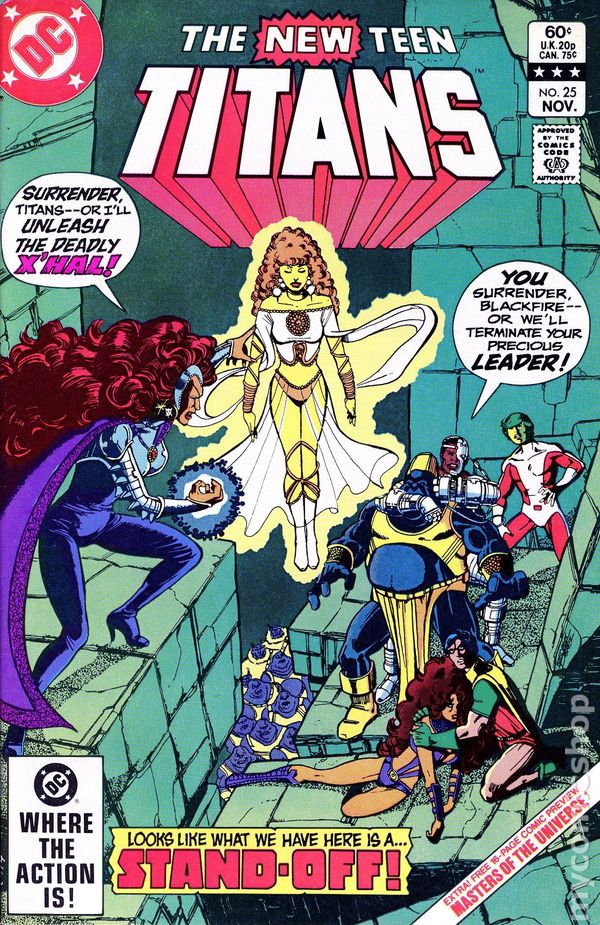
Number 45 The New Teen Titans From DC Comics The New Teen Titans From DC Comics Two of the most coolest thing about this logo is the word "New" and "Titans" ... First of all the word "New" is the neatest thing about this logo because it's put the emphasis on the team itself and they (DC Comics) did that for a reason to promote it and get this group back up and running again. This is my favorite Titans team and the reason for that ... it's has a great chemistry and rapport. The word "Titans" is another selling point and that part of the logo is very bold, make a statement here and there and that's the whole beauty of it. Those two words and the rest of it ... put together quite nicely. I loved the bottom part of the word "Titans" too and that's brings a lot to the table here. I just can't begin how to describe it and I just don't have the right words to do that and all that ... You just can't go wrong with it.  The best crossover ... and even the white here ... it's that cool!  Here's another good example of the color White ... and it's works for me here ...  |
|
|
|
Post by Deleted on Feb 22, 2018 12:56:36 GMT -5
Number 42  The Elongated Man From DC Comics The Elongated Man From DC Comics One of my personal favorites ... it's fits the character nicely and the letters are stretched out giving it's class and uniqueness. The colors purple works for me and any other will do. I had this logo at 88 as a starting point and works it's way up to 44 and I was liking more and more as I did this project that I'm doing here and that's the fact that this is one of the most original logo that's should had never changed and when they did ... The words ... "The" and "Man" ... really makes it Pop! and that's the whole beauty of it and the way they did it makes it even better ... put the whole shebang really a cool logo beyond means here.  This is wrong and I know it! They got it all wrong and I hated this logo so much ... I've just don't understand why they changed it in the first place when he got his first book? ... it's doesn't look right to me and rightly so. Two more examples even with the red and the yellow works for me.   |
|
|
|
Post by Deleted on Feb 22, 2018 19:14:59 GMT -5
For the record ... The Elongated Man and Supergirl Logos are reversed - Elongated Man at 42 and these Supergirl Logos moved down a notch, meaning that these logos are now #43 and #44. I made another mistake here.
|
|
|
|
Post by Deleted on Feb 22, 2018 19:47:06 GMT -5
Number 43 and Number 44  These logos are my top two Supergirl From DC Comics   Note: Note: Most of the logos that I've seen were white as the main color and I'm including two of my favorites here. I'm not beating around the bush here and I'm going to keep this short and all that ... I've feel that DC Comics didn't do a good job creating an image for her here and not making it original and all that. I've did not care for this logo at all ... the Small Cover one here ...  I don't like the "i" being dotted and all that. I just don't understand why they gave these logos to her and not making it unique and just copy the Superman Logo instead. I've just don't have the answer for it. Anyway, these logos on these covers are good and I've seen lots of these in my lifetime and I'm saying that I'm not happy with the direction that DC Comics took for not making it more original. It's a good logo and nothing more.   I'm in loss of words and that's not an easy thing to say about it. |
|
|
|
Post by Deleted on Feb 23, 2018 1:24:46 GMT -5
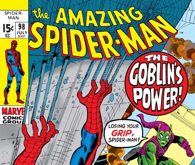
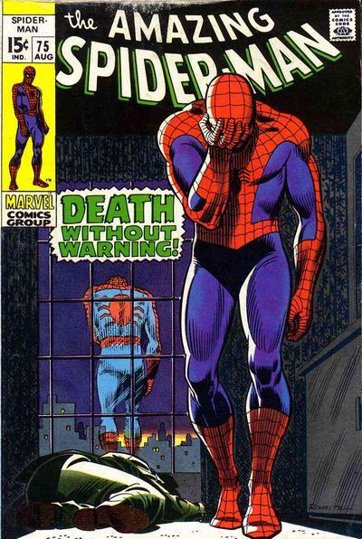
Number 41 The Amazing Spider-Man From Marvel Comics The Amazing Spider-Man From Marvel Comics Logo from Number 69 Some Similarities but the logo today (here at 41) is far better because of the slight blue background in the word "Spider-Man" and that's why I like this one better and the word "The" is on the same plane/level with "Amazing". The one on top is the one that I seen the most in my life reading comic books dealing with the Web Slinger himself. It's bold, good looking, nicely laid out, and make use of space better than one that I showed you in Number 69. Just about the best Spider-Man logo that I know of ... Very Iconic and nicely done by Marvel Comics!  I like the logo where they use Yellow instead of Red and use Red for the background as well here.  The White works too exceptionally well too ... Green for the background works wonderful here too.  |
|
|
|
Post by Deleted on Feb 23, 2018 1:26:44 GMT -5
40 Logos to Go ... I should be done by mid-March or so. 110 Logos shared and discussed here. 
|
|
|
|
Post by hondobrode on Feb 23, 2018 8:43:47 GMT -5
I've always liked the Amazing Spider-Man logo
|
|
|
|
Post by Deleted on Feb 23, 2018 20:35:15 GMT -5
I'm taking a break from this thread to review the remaining 40 logos to make sure that I got the right one in proper order. I'm thinking of returning this thread in a week from now. Thanks Everyone! It's should be done by the end of March ...  |
|