|
|
Post by Deleted on Feb 27, 2018 9:32:51 GMT -5
MechaGodzilla, where do you place this Batman logo?  Sent you a PM ... Thanks. |
|
|
|
Post by Deleted on Feb 27, 2018 22:05:47 GMT -5
Number 32  The Atom From DC Comics The Atom From DC Comics One of my favorites as a kid and always be ... and it's a winner and always be. This logo and the big picture that I found in the internet shows the impact that on any cover that DC published. There is nothing wrong with it and sad that this logo is not a good of the next 31 logos on my countdown and the picture that I shared has a lasting impact on me. I loved the lettering style, the slantness, the faint contrasting color that they used to outlined the logo itself. It's a thing of beauty! Favorite Picture of the Atom!  |
|
|
|
Post by Deleted on Feb 28, 2018 2:05:52 GMT -5
Number 31 Captain Atom From Charlton/DC Comics Captain Atom From Charlton/DC Comics I know that this character is a part of Charlton and I prefer this logo over any of the logos that DC Comics created and making this an exception. Anyway, the coolest part of this logo is a picture of an atom being used to symbolize the letter "O" and nothing more and the simplicity of it shows you that they made it unique and totally different one indeed. Here's a copy of cool covers from Charlton Comics that I feel that is why I prefer these logos are the best that I've seen. Another cool part from this logo is the color that's was used for the letter "O" in the old Charlton Comics and I'm pointing out that this I like this part of it very much and I'm glad that they did this. The rest of it ... is plain, good, its captures a certain charm to it and that's why this logo is ranked at 31. These are my favorite covers from this era of Captain Atom.   |
|
|
|
Post by Deleted on Feb 28, 2018 5:08:20 GMT -5
Number 30 The Spectre From DC Comics The Spectre From DC Comics My most painful entry in my countdown and I have to put this logo at Number 30 and I have read several dozen books in my lifetime and that logo that I shared with you is an instant classic at Number 30 and rightly so. The green trim really spooks you and the logo itself is an haunting one that's why I love it so well ... The placement of the word "The" and the slantness of it ... is nothing more short of perfection! Nothing wrong with it and I just can't find a bad thing about it.  It's fits the character just beautifully and masterfully ... and works so well that's makes it a masterpiece in my own mind. Artwork of the above Cover ... looks better in Black and White!  |
|
|
|
Post by Deleted on Feb 28, 2018 12:20:41 GMT -5
Number 28
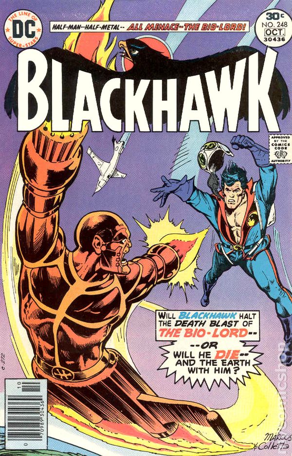
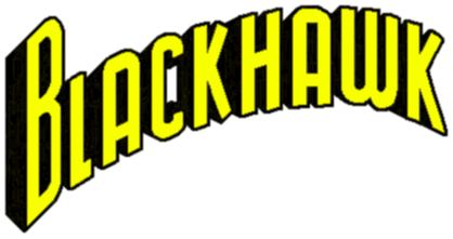
Number 29  Blackhawks From DC Comics Blackhawks From DC Comics These two really stands out and the boldness shines and loved the way the lettering goes and one of my favorites in the Golden Age of Comics (Silver Age too) because I read a lot of these books because of the sex appeal of Lady Blackhawk.  That's out of the way and back to the logos ... these logos are one of my favorites because they have eye appeal and stands out just beautifully and I just loved the color Yellow over any other colors and other colors work well here too. I loved them both equally well and the one with the bird head in the middle is very original and awe inspiring as well. The Black in the Background makes its stand out even further and that's who nature why this logo is one of my favorites and the uniqueness that's brings. Here's three covers that ... and in any color scheme ... makes it one of the best logo in both Golden and Silver Age of Comics. Just a fantastic logo ... very original and dynamic too. Just by looking at it ... you want to buy the comics!    Got 27 more to go ... |
|
|
|
Post by dbutler69 on Feb 28, 2018 16:46:16 GMT -5
I like the lower Blackhawk logo, such as the one from #250.
|
|
|
|
Post by Deleted on Mar 1, 2018 6:08:36 GMT -5
|
|
|
|
Post by Deleted on Mar 1, 2018 6:39:54 GMT -5
I like the lower Blackhawk logo, such as the one from #250.  I was thinking about what you've said here and I totally forgot the other one here and you've jarred my memory here and I have to say this is a really an excellent logo I've may add here. I've think the one from #250 and this one here should be ranked and I should had dropped this one a dozen of notches from my list and bumped the Alpha Flight Logo for good.  Good Call on your part ...  |
|
|
|
Post by dbutler69 on Mar 1, 2018 8:07:13 GMT -5
I agree that The Champions is a solid logo, and I like the contrasting colors too. I don't think I'd have noticed the placement of the "The" if you hadn't mention it, but it is pretty neat. Something different.
|
|
|
|
Post by Deleted on Mar 1, 2018 9:33:17 GMT -5
Number 25
Number 26
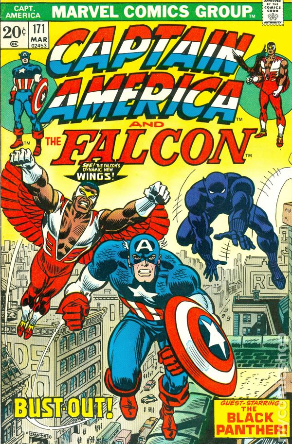
Special Considerations   Captain America From Marvel Comics Captain America From Marvel Comics Earlier this morning while finding appropriate covers for my Captain America and my Countdown to Number 1 ... I felt that I made another error (my 4th) in finding logos for this lineup and one with the Comic Book is my Special Consideration because I felt that I made a big mistake for not doing my homework here. The two logos here are pretty much even and I felt the one with the word "Falcon" is a downer but its ranked high enough at #26 here. The picture here are worth a thousand of words here and I don't need to dwell the good and the bad here and I felt that Marvel Comics did an excellent job showcasing these logos here. These always stands out and furthermore are so iconic that Marvel had this for a very long time.   Bold, Colorful, and one of the greatest logos in Marvel History ... Very Iconic especially the one on top (the Cover) because it's grand, cool, and so Patriotic Looking. 24 Logos to Go ... |
|
|
|
Post by Deleted on Mar 1, 2018 9:50:01 GMT -5
Sneak Peek at Number 19 For the Record and this reveal will be coming your way in a few days from now is a big blockbuster of the TOP TEN JUSTICE LEAGUE OF AMERICA LOGOS that I personally saw in the 1st 500 Comic Books in my lifetime and that reveal is going to be an experience that you don't want to miss. The best Logo of the Justice League is ranked at Number 2 and that's pretty much a no-brainer here and I've always loved that logo! |
|
|
|
Post by Deleted on Mar 2, 2018 3:15:24 GMT -5
Number 23
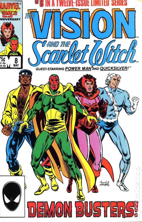
Number 24  Vision and The Scarlet Witch From Marvel Comics Vision and The Scarlet Witch From Marvel Comics These two are one of my favorite logos in Marvel Comics and I have to say this the dynamics of these two shines, great imagination, and most of all the elegance of the logo in blue is spot on and the red is an impactful logo that really pops and all that. From now on ... just enjoy these logos and everyone of them don't need an explanation of how good they really are. The selling points of this logo is the "The" and "And The" that's makes this a winner in my book. One other thing ... the colors that they did here for "Vision" is extremely good.  The star of this powerful logo is the lettering and graceful curves that resembles an arch that shines and this time it really strikes you and it's has great visual appeal that's quite stunning.  |
|
|
|
Post by Deleted on Mar 2, 2018 9:22:03 GMT -5
Number 22

Black Cat From Marvel Comics I had this logo as high as Number 7 on my Countdown and more that I've thought about it ... the logo itself didn't do me any justice to keep it there and I had to rethink everything about it. It's doesn't have the spacing t make it work but it's does attracts readership to a certain degree here. I find it very unique, powerful, bold, and the one thing that brought it down to Number 22 ... it's not a very feminine logo for this character alone ... but it's does reminds you that this is a cat-like logo ... because it's resembled a claw sort of speak here. It's a very difficult logo to describe here ... I just loved this logo because simple curves and angles and the font is very good and short of perfection from an artistic standpoint. This comic came out in the 1990's (July 1994) and became a winner for me. Another reason why this logo is down to Number 22 is ... Felicia Hardy:
The words Felicia Hardy on the opening cover Number 1 here that knocks it down to 22 and I consider it a no-no in my book ... if they left that alone like the one on top ... it's would had been Number 7!   Favorite Picture of her with Spider-Man here ...  |
|
|
|
Post by Deleted on Mar 2, 2018 11:56:22 GMT -5
Number 21
All Star Squadron Team from Commander Steel to Hawkman from the bottom and to Green Lantern from the top on the right side down to the Atom ... makes this team complete!
 All Star Squadron From DC Comics All Star Squadron From DC Comics Two things that stands out is the big White Star on the upper left side and the Yellow Star inside the "A' in Squadron and that's the total beauty of this great logo here. The colors they used here is just great and it's a fantastic logo and this has eye appeal all over it.  One of my favorite books and I have fond memories reading these great stories and I hold them dear to my heart. Many people at my LCS told me that this is one of their favorite logo too. No need to say more ... it's a winner in my book! Great Splash Page from All Star Squadron #3 From Joe Kubert!  |
|
|
|
Post by Deleted on Mar 2, 2018 11:59:43 GMT -5
130 Down and 20 to go ... Tomorrow a total surprise for all of you here!
|
|