|
|
Post by Deleted on Mar 2, 2018 12:41:41 GMT -5
All Star Squadron... probably my favorites series - EVER!
|
|
|
|
Post by Deleted on Mar 3, 2018 0:01:12 GMT -5
Number 20  Thunder Agents From Tower Comics/DC Comics & Others Thunder Agents From Tower Comics/DC Comics & Others I'm more familiar with this Team when Wally Wood (Tower Comics) and also with JC as well and started reading this series - see picture below. 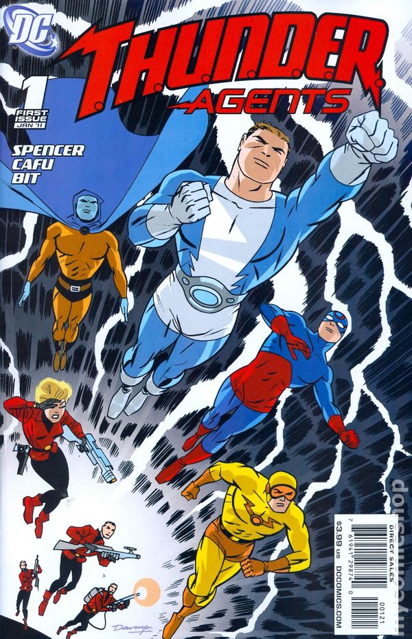 I just loved this logo and this is the first time that I've seen it about a little more than a year ago when I've stumbled on Shaxper's thread. The "T" and "A" ... the first letter of the logo is got to be one of the coolest thing about it and I was blown away by it. The "A" itself propelled this logo to Number 20 and the "T" enhances and secured it's spot. I've just don't know how to describe it ... but that logo is so unique, bold, crisp, and packed a punch that's so noticeable and it's really stands out in the crowd ... the periods inside the words "Thunder" has a hidden meaning ...  Enough Said Here ... Just simply the best logo (new) that I've ever seen in my lifetime ... went from ZERO to Number 20 with no problems at all. |
|
|
|
Post by Deleted on Mar 3, 2018 5:22:07 GMT -5
Number 19
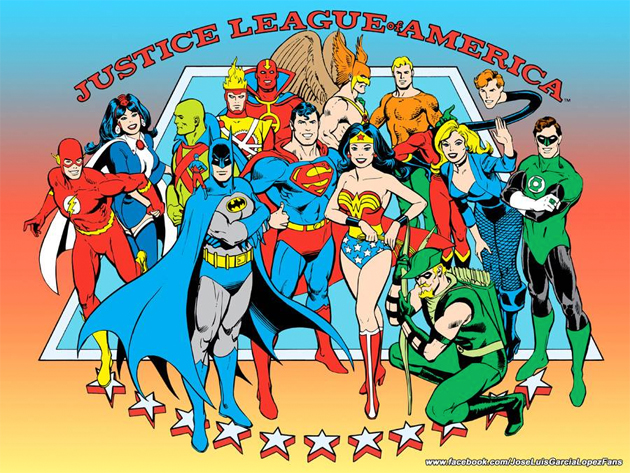

Part 1 of 2 Number 19 is handled differently ... I have personally seen and read the first 500-700 Justice League of America Books in my lifetime and I'm about to show you the best 10 that I've seen except one that I'll reveal at Number 2 later in this countdown that I feel it is the best of the best JLA Logos that I've seen. In my next post ... I'll reveal my top 10 logos and what books that logo came from and share an item of two about them! Number 18 will be revealed on Monday and I'm taking the weekend off from this thread. |
|
|
|
Post by Deleted on Mar 3, 2018 6:22:40 GMT -5
Number 19


Part 2 of 2 1st Place - Justice League of America - Issue #4
 Great Logo and a Classic that used often in the first 250 issues and the good part of this logo is the use of colors - Patriotic Style. 2nd Place - Justice League of America - Issue #64
 Another Patriotic Logo and the coolest part of this logo is the heads of Batman and Superman included here. 3rd Place - Justice League of America - Issue #51
 I love the colors here and another thing of beauty too ... same Patriotic theme. 4th Place - Justice League of America - Issue #204
 The Yellow League and Stars - makes it a very bold and powerful logo and I dearly loved this logo very much! 5th Place - Justice League of America - Issue #84 This logo is a classic due to the White Stars and the great way that they incorporate the red, yellow, and black to make this logo really stands out. 6th Place - Justice League of America - Issue #57 The Black is used along with the three different colors to create an impactful logo of that's stands out just beautifully. 7th Place - Justice League of America - Issue #53 The gradual use of Orange going down to Yellow really used correctly and just creates a harmony logo that's pleasing to the eye. 8th Place - Justice League of America - Issue #203 A real classic logo with a different use of Blue, White, and Red. The White Stars enhance this logo and the trim surrounding the red lettering just makes it a great logo to start out with. 9th Place - Justice League of America - Issue #67
 It's a rarity to see Purple being used to create this logo and the Yellow Background and Black Stars and League ... gave it an impact that rarely used in these logos. BTW - Purple and Gold was my High School Colors! 10th Place - Justice League of America - Issue #188 Similar to 9th Place Logo and the only difference is Red being used here instead of Purple. One of my dear favorites ... All of these logos came from the Satellite Era of the Justice League of America and I consider that Group the Best of the Best ...  The Justice League of America !!! The Justice League of America !!!
|
|
|
|
Post by Deleted on Mar 4, 2018 6:14:46 GMT -5
Number 18 Invincible Iron Man From Marvel Comics Invincible Iron Man From Marvel Comics To me, this the BEST LOGO IN MARVEL HISTORY outside the Golden Age of Comics. It's carries a pack and a wallop of how powerful that this logo carries. It's slated downwards of the word "Iron Man" and looks like a steel girder with rivets that clearly shown here and the words "The Invincible" is the first thing that most people noticed and knowing that when you have all three words together ... it's a thing of beauty!  I know that they did some other colors and all that ... I just having a hard time dealing with them like this one below you ... this isn't right to me - but its still a great logo.  These two are the best of the best ... To me, they should had stick with this one for the whole time ... Black Background, Yellow as the Primary and Red as the Secondary ... is the my favorite Marvel Logo!   Great Picture of Iron Man ... One of my favorites ... 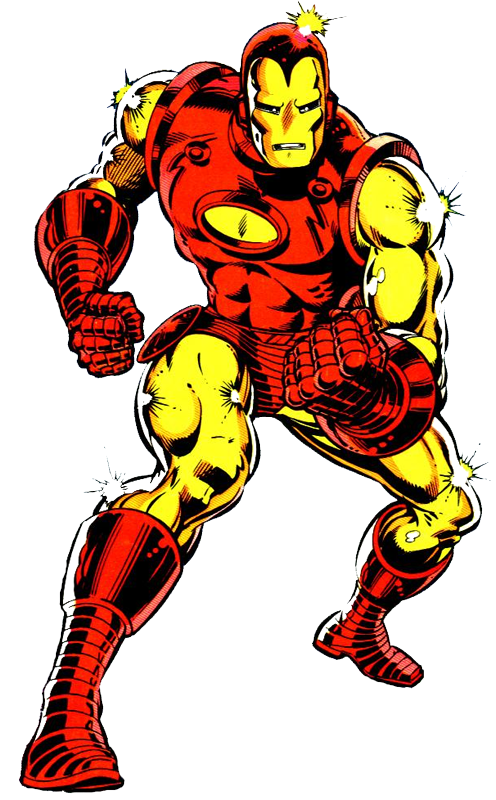 |
|
|
|
Post by Deleted on Mar 4, 2018 10:44:10 GMT -5
Number 17 Black Canary From DC Comics Black Canary From DC Comics This logo used to be in slot Number 13 and in the last minute change, I've decided to move it down to Number 17 for one reason ... too much color that was used in this logo and still a darn good logo to look at. But, the colors are done very tastefully and respectable too. It's stylish, creative, and very unique and this logo is done with professional pride by the folks at DC Comics and that's why I loved this logo from the get go and always the best Black Canary Logo and the only one that I've liked and all the rest of them are purely not my cup of tea. The logo originated in the late 80's and/or early 90's ... my memory isn't all that great in terms of this logo appearance(s) and having said that this logo came from this Black Canary Book In the internet searching for new pictures ... came out in 1991.  One of my favorite covers in this series of books by DC Comics showcasing the Black Canary! ... The reason for that ... is the picture of the tulip and a very dramatic pose by the Canary herself.  Couple of favorite pictures of the Black Canary .... Her involvement with the Justice Society of America  Her involvement with the Justice League of the America with the motorcycle that was built by Superman here. Note: That picture of her head here was used in making my avatar for the Justice League of the America and that picture is my favorite headshot of her. 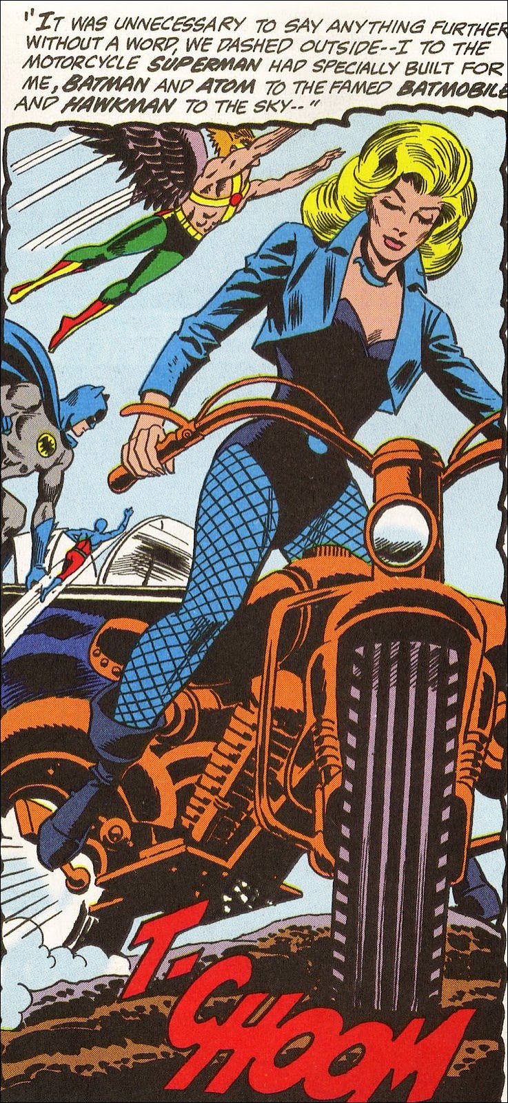 |
|
|
|
Post by chadwilliam on Mar 4, 2018 11:19:48 GMT -5
That's a great Iron Man logo but beyond the girder and rivets look you mentioned, I also like the way it's angled as if you're looking at it from above rather than head on. It feels as though the reader is actually descending into the cover as though someone built a giant 'IRON MAN' logo out of steel, placed it on a mountain, and you're looking down from the sky.
|
|
|
|
Post by Deleted on Mar 4, 2018 23:36:28 GMT -5
Number 16
Number 15
Number 14   Superman From DC Comics Superman From DC Comics The one on the bottom is my personal favorite and the other two are just good as they come. I prefer the bottom one over anything else because using the picture of Christopher Reeve ... the bottom logo the one with the red lettering and blue background fits in the character and the logo itself.  It's a thing of beauty here and that's why I prefer it. You have to factor in the character's costume in order to create the logo itself and that is what I'm saying here. Even in the Golden Age ... it's works! 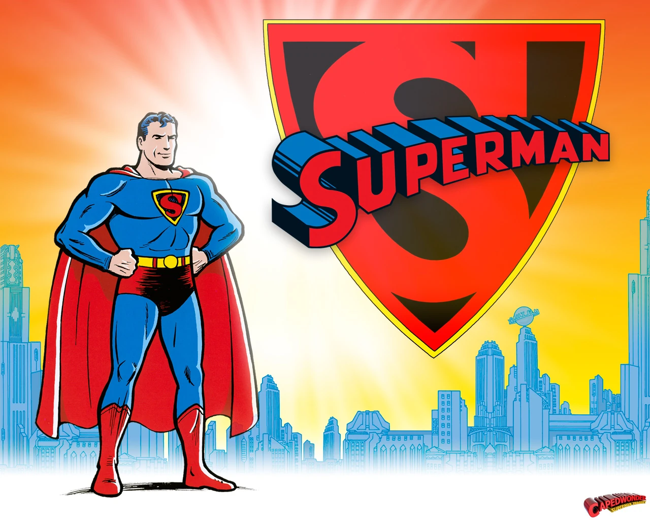 That's proof that the one with the Red Lettering and the Blue Background Colors is the best of the three and it's shows how important to design it properly. The Red Cape, Boots, and Trunks are your primary color here because it focus on the attention of his cape and boots first. Anyway, it's a classic ... and you've just can't go wrong with it.  Favorite Art Piece by an unknown artist that I've found in the internet three years ago. |
|
|
|
Post by Deleted on Mar 5, 2018 10:50:23 GMT -5
There is a huge gap between Logo 11 to Logo 13 because - I have a very difficult decision to make and the Logos 10a, 10b, 10c, and 10d ... they are all on equal level and can't be separated at all. That's decision is final and I've made my last changes to this countdown and I'm extending this thread for another week or so.
I'm using pictures that I've downloaded and will be posting three pictures per logo and doing something different from now on. I've hope that my decisions here is a good one indeed.
Starts Tomorrow!
|
|
|
|
Post by dbutler69 on Mar 5, 2018 16:21:56 GMT -5
I agree that JLA Issue #4 has the best of the JLA logos.
Iron Man is a great logo.
Superman is a classic, too, though I'd probably put Iron Man and JLA ahead of it.
|
|
|
|
Post by Deleted on Mar 5, 2018 23:20:34 GMT -5
Reminder - Next Four Logos starting with 10d of which will appears shortly and the next three logos after that are all in equal rank.
|
|
|
|
Post by Deleted on Mar 5, 2018 23:56:58 GMT -5
Number 10d   The Brave and the Bold - From DC Comics The Brave and the Bold - From DC Comics One of the most original logo in the History of DC Comics and one of the most impressive and iconic logo that's will stands for the test of time. It's been around so long and sadly hardly used at all these days. I've loved the banner flag aspects of it and most importantly it's a gorgeous logo that uses the right font that makes it a beauty of the ages. Brave and the Bold #63 - was the last Brave and the Bold stories that I read and it's one of the craziest and the neatest stories that I've ever read and the Splash Page showed the beauty of Supergirl and Wonder Woman in a way that's I've didn't expect. They transformed these female heroes into glamour gals that's befitting Hollywood Starlets like Lana Turner and Elizabeth Taylor. The word "Brave" and "Bold" done just right and they used the color of Pink to emphasize that this adventure involved two popular female superheroes in this book and that's the selling point of this book. Anyway, it's a classic logo and one of my favorites ever since I've lay my hands on it. Another great selling point of that gorgeous logo is that resemble a banner that uses in the good ole days of England right around the days of Knights and Lore. It's a thing of beauty and it's have a honor of sharing the next 3 logos at Number 10. |
|
|
|
Post by Deleted on Mar 6, 2018 9:10:56 GMT -5
Number 10c   Captain America From Marvel Comics Captain America From Marvel Comics Personally, this logo is one of my all-time greats and it's packed a punch that this logo is bold, dramatic, has an everlasting impact on one of my favorite Marvel Characters. The Gold Color is right on the Money and it's doesn't need any enhancing colors and the font is spot on - superior in every way. The logo in the Splash Page here is another Golden Age Favorite too ... it's very patriotic and star spangled as well. The Black surrounding the Gold here is a powerful color that makes this logo "Pops" and that's makes it a cool combination as well. The logo itself ... worth a thousand of words and you don't need me to write up an explanation for it.  I don't consider these pictures of Shield a logo because these are equipment for Captain America to fight evil whatever he goes. Another Great Splash Page in that Era - Golden Age  |
|
|
|
Post by Deleted on Mar 6, 2018 13:10:22 GMT -5
Number 10b   All Star Comics From DC Comics All Star Comics From DC Comics One of the all time greats and it's done just beautifully and gorgeously beautiful design for the early adventures of the Justice Society of America. This is so perfect and I just feel so bad to put this at 10b for my countdown. The word "ALL" done in a great way and it's really stands out here. The word "Star" with its Red and White Stars enhance it and that's the main attraction of this iconic logo here. The word "Comics" done just in a stylish manner that in Blue really makes it more patriotic and with that and all the rest of the words of this logo is done in the way that's makes it a fantastic logo to begin with. It's All-Star Comics #36 that has an lasting impact that's stands for the test of time. Another favorite Cover, is All Star Comics #58 that has the first appearance of Power Girl and this is an excellent example of this logo works for me. My 2nd Choice here ...  Another winner is this one here below ... this is my 3rd Choice!  |
|
|
|
Post by Deleted on Mar 6, 2018 15:04:28 GMT -5
Number 10a   Robin From DC Comics Robin From DC Comics The best sidekick logo of all time ... its pure gold and the reason for that ... Yellow for his cape and red for his Red Vest that he wears and the Bat Symbol symbolized that he's the sidekick of Batman and his wording "The Boy Wonder" puts an emphasis on his relationship with the Caped Crusader himself. It's just too good of a logo and the big thing about it's simple, has great charm, and history. It's gets instant recognition from readers like you and me. /BatmanStyleGuide1982-13-57becd4d5f9b5855e5af81ab.jpg)  Later on he got upgraded to "The Teen Wonder" to show his maturity and his association with the Teen Titans of where he is often the Team Leader of that group. It's that simple. |
|