|
|
Post by dbutler69 on Jan 18, 2018 8:59:16 GMT -5
The first Captain Comet logo is soooo much better than the second one!
Yeah, none of the Dr. Fate logos is particularly good. The first logo would be good, if he had lightning powers or something. The second and fourth ones are OK, but boring. The third one is just terrible.
|
|
|
|
Post by Deleted on Jan 18, 2018 9:24:17 GMT -5
|
|
|
|
Post by dbutler69 on Jan 18, 2018 16:19:00 GMT -5
The white Doctor Strange logo would look more fitting for a horror comic, with that "Strange" font.
I think I like the second Doom Patol logo (the one you said is also a winner) best. The first one is god too. The others are kinda ugly, IMHO.
|
|
|
|
Post by Deleted on Jan 18, 2018 16:34:31 GMT -5
  I like these. |
|
|
|
Post by Deleted on Jan 18, 2018 16:40:52 GMT -5
  I like these two. |
|
|
|
Post by Deleted on Jan 18, 2018 16:41:29 GMT -5
Out of the logos so far, my favorites are the Silver Age Aquaman and Doom Patrol. Also the Dr. Fate logo that was used in the 70s. The Ts remind me of an ankh.
|
|
|
|
Post by Deleted on Jan 18, 2018 20:03:47 GMT -5
|
|
|
|
Post by Deleted on Jan 18, 2018 20:53:20 GMT -5
You are right. The FF's logos have been mediocre. The only ones I liked a little are the two listed above. |
|
|
|
Post by dbutler69 on Jan 19, 2018 11:01:56 GMT -5
I like the first twp Captain Comet logos though, yes, it would be better if his arm wasn't in the way of the first one. I know of him thanks to The Secret Society of Super-Villains. You should check it out!
I like the first Defenders logo, and I think the second one is sorta ugly. That first Doctor fate logo (yellow & sky blue) is pretty good.
|
|
|
|
Post by Deleted on Jan 19, 2018 11:20:57 GMT -5
I like the first twp Captain Comet logos though, yes, it would be better if his arm wasn't in the way of the first one. I know of him thanks to The Secret Society of Super-Villains. You should check it out! I like the first Defenders logo, and I think the second one is sorta ugly. That first Doctor fate logo (yellow & sky blue) is pretty good. The Secret Society of Super Villains is on my list of top 100 ... what rank it is ... you have to wait for it! |
|
|
|
Post by Deleted on Jan 19, 2018 11:27:05 GMT -5
I'll resume this thread tomorrow ... I have an all day meeting with my club and hopefully my first 50 honorable mention logos should be done in 2-3 weeks from now.
After that, I'm going to my top 100 and do one a day ... take a day off ... and resume this thread and I'm planning on spending 200 days to get down to Number 1 on my list. This thread should be done by Halloween at the latest. I'm taking my time to do things right and this is a project of the making.
|
|
|
|
Post by Deleted on Jan 20, 2018 4:45:36 GMT -5
|
|
|
|
Post by Deleted on Jan 20, 2018 8:32:39 GMT -5
|
|
|
|
Post by Deleted on Jan 21, 2018 5:15:23 GMT -5
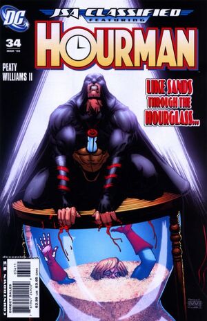
 Hourman from DC Comics Hourman from DC ComicsThis is the nicest logo that I could find and it's has a certain charm about it and it's very attractive and looks great. The only thing that I don't care for is the letter "R" of which they tried to incorporate the Hourglass into a Symbol and that's I just have a thing against it. Like I said earlier, symbols aren't allowed into the design of the logo and I'll make some exceptions later on this thread. I loved the white lettering with the red background that they decided to use. With the Black Trim makes it's better ....  If the logo stripes were extended straight without the "R" being like that ... it's would had cracked my top 100. That's why it's in the Honorable Mention list here.   The clock in the 1st image is a no-no in my book and the classic Showcase is just too plain looking! These two are excellent logos for its worth - but they don't grab your attention especially mine. Special Note: I'm going to do one post for each logo from now on starting today! |
|
|
|
Post by Deleted on Jan 21, 2018 5:36:04 GMT -5
 Infinity Gauntlet from Marvel Comics Infinity Gauntlet from Marvel ComicsWhen, I looked at this logo and it's an unusual logo to look at and I don't mind seeing the infinity loop design that's part of it in a minor way possible and the reason for this - I think it is a "space killer" ... A space killer is my term of using the space to its fullest and Marvel Comics did a great job placing that infinity loop below the word "The" and that's works for me in a positive note. I loved the multi-colored stones at the bottom of the logo that's alone makes it's complete. This is a very rare logo that I really like in the first place but what brought it down it's a little on the plain side from me. The only bad part of it ... the blue background is too dominate and that's made it difficult for me to accept it and that's why I just can't place it in my top 100.   These two are just too plain and not satisfactory to my approval.  This one the word "WAR" dominates and I do consider this part of the family of the Infinity Gauntlet logo and I just can't accept it at all. One more thing ... my Honorable Mentions will be done by the 31st of January or earlier. |
|