|
|
Post by Deleted on Jan 21, 2018 10:56:31 GMT -5
|
|
|
|
Post by Deleted on Jan 21, 2018 11:24:23 GMT -5
|
|
|
|
Post by Deleted on Jan 21, 2018 19:14:09 GMT -5
|
|
|
|
Post by chadwilliam on Jan 22, 2018 0:33:10 GMT -5
 Justice Society of America from DC Comics Justice Society of America from DC ComicsI wished DC Comics made a more decent logo for this great group in the Golden Age of Comics and beyond. It's interesting that here you have a team which didn't appear in a title called 'The Justice Society of America' and therefore didn't actually have an official logo until decades after their debut. It would sort of be like having Superman appear only in Action Comics and World's Finest up until the 1970's and therefore not having any sort of 'Superman' logo by which to represent him. Question then, for you Mecha: Will your list contain only logos which utilized the character's name (ie. 'Superman', 'Batman', 'Spider-Man', etc.) but not titles which didn't contain (ie. 'Action Comics', 'Detective Comics', 'Amazing Fantasy', etc)? Because while I like a few of the Justice Society logos you've found here (the one above plus the two in Michael's reply) when I think of Justice Society and cool logos I think of:  That's a great logo but of course, it isn't the name of a superhero or team. |
|
|
|
Post by Deleted on Jan 22, 2018 3:59:21 GMT -5
 Justice Society of America from DC Comics Justice Society of America from DC ComicsI wished DC Comics made a more decent logo for this great group in the Golden Age of Comics and beyond. It's interesting that here you have a team which didn't appear in a title called 'The Justice Society of America' and therefore didn't actually have an official logo until decades after their debut. It would sort of be like having Superman appear only in Action Comics and World's Finest up until the 1970's and therefore not having any sort of 'Superman' logo by which to represent him. Question then, for you Mecha: Will your list contain only logos which utilized the character's name (ie. 'Superman', 'Batman', 'Spider-Man', etc.) but not titles which didn't contain (ie. 'Action Comics', 'Detective Comics', 'Amazing Fantasy', etc)? Because while I like a few of the Justice Society logos you've found here (the one above plus the two in Michael's reply) when I think of Justice Society and cool logos I think of:  That's a great logo but of course, it isn't the name of a superhero or team. I consider All Star Comics and the Justice Society Logo two separate things and in the early days of the Justice Society that logo All Star Comics got attached to them and yet it's not an official logo and it's somewhat bothers me. The All Star Comics logo is in my top 100 and you have to wait until it's shows up. I understand what you're saying is but it's bothers me because that logo All Star Comics and Justice Society of America got attached and yet ... I just can't accept it as a Justice Society of America Logo but a name of the book that showcases them. So your question isn't a name of a superhero or team? ... Neither, it's the name of the book and only book.
 Book Title Alone, just like Brave and the Bold for the Justice League of the America - but Justice League already had a logo and that's why that logo seems to be the 1st (unofficial) logo for the JSA and confused me at first and I started asking questions about it. I've just can't accept it as the logo for the Justice Society of America.  |
|
|
|
Post by Deleted on Jan 22, 2018 9:04:04 GMT -5
 Kid Flash from DC Comics Kid Flash from DC ComicsOne of the better sidekicks logos around and I loved the pure simplicity and the straight lines on the letters indicating speed and the beauty of this logo. You just can't go wrong with this one and having said that its a bold and striking logo to begin with and that's makes it a good logo to look at and admired for.  I've considered this logo above and I can't accept it as face value because the letters F and L are in various shades of orange and half of the letter A is orange and yellow. But, the reason for doing this logo because his costume is red and yellow and that's alone creates an orange color and that's why they did it. But, its telling me that his costume is orange while running at Superspeed and that alone creates a conflict of interest of really what his costume colors are. That's why I don't accept it at all.    These three aren't my cup of tea and I just find them not my style and I don't care for these at all. |
|
|
|
Post by Deleted on Jan 22, 2018 9:22:51 GMT -5
 Green Lantern and Green Arrow Logo from DC ComicsNote: Green Lantern and Green Arrow Logo from DC ComicsNote: I've named my file Lantern Arrow to keep it separate from Green Arrow for a reason. I like this logo for a variety of reasons because it's bold and it's has a nice ring to it and loved the Green Lantern figure in the middle indicating that this book showcasing Green Lantern first and Green Arrow second. Co-Starring makes it's real and that's beauty of it.    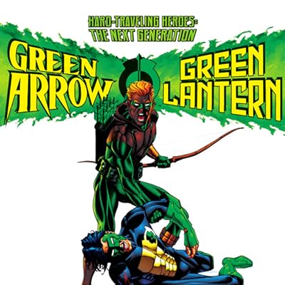 All of these four aren't my favorites because of the lettering and it's offers no consistency especially the one in Green and Yellow! ... The one on the left is not my favorite because I just can't accept the white and green working together and that's why I don't care for it at all. The ones on top are too modern looking and I just can't let it be included in my top 150. The one on top is the best of the 5 logos that I've shared with you today! |
|
|
|
Post by Deleted on Jan 22, 2018 9:38:47 GMT -5
I agree this is one of the coolest logos ever:  I thought this one was pretty good:  |
|
|
|
Post by Deleted on Jan 22, 2018 10:26:50 GMT -5
Thanks md62 ... I liked that logo ^^^ too! |
|
|
|
Post by Deleted on Jan 22, 2018 10:42:22 GMT -5
 The Man-Thing from Marvel Comics The Man-Thing from Marvel ComicsOf all the logos associated with this character this one is the cream of the crop! ... I feel really bad not making it in my top 100 because I feel that this logo did everything possible to make it work for this character and that why they did this design in the first place! ... Very Bold and beautifully crafted and powerfully striking letters! The black "The" makes works for me and offers contrasting look and the red with the Yellow and Black borders trim makes it very unique and that's why I like it so much. Black on Yellow works for me just great!   These two are too puny for colors and style. You hardly see the word THE on the logo on the left.  This one the black and white not accepted in my book. Giant Size destroyed it and that's why I don't care for it.  The word "Infernal" killed it. If that word were out of it ... and just Man-Thing and the colors and all ... that's would been my pick for top 100; not 50 honorary ... That's all for today and more coming up! |
|
|
|
Post by Deleted on Jan 22, 2018 13:20:29 GMT -5
|
|
|
|
Post by Deleted on Jan 22, 2018 13:40:11 GMT -5
 Metal Men from DC Comics Metal Men from DC ComicsI've prefer simple and clean cut logos and this silver (with the gold trim) one is the best of the best. I'm know some of you feel that I did not select this one below me because the color are all wrong and so is everything else about it.  This one is okay ... but, too dark for a logo to begin with.  I have never ever seen this one before and I can't rate it. Yet, its been used in a comic book! See picture below it.   I'm not familiar with this comic book series ... only the old one! The one with Gold coloring is so close but ... I don't associate gold being a metal and that's why I prefer silver one on top because it's more metal and steel like. This one takes 2nd place of the logos that I've seen.  |
|
|
|
Post by dbutler69 on Jan 22, 2018 16:07:43 GMT -5
I like the Ghost Rider logo with red lettering and the flames (which transition from orange to yellow) behind it best.
Those two Golden Age Green Arrow logos are both good, but I also like the ones with the arrow inside the "o".
The Hourman logos are blah.
|
|
|
|
Post by Deleted on Jan 22, 2018 17:04:41 GMT -5
I like the Ghost Rider logo with red lettering and the flames (which transition from orange to yellow) behind it best. Those two Golden Age Green Arrow logos are both good, but I also like the ones with the arrow inside the "o". The Hourman logos are blah. The Hourman logos are okay in my book but they aren't that spectacular to me and what you've said "blah" is fair game. If I were to place it would fall between from 140 to 150 in placement in this countdown. At one time, I've considered dropping it from my list of logos but it's survived the cut. The "R" followed by the word "Man" is pretty bad. What saved it is the "H" followed by OU and those letters were okay in my book. Thanks for your comments and appreciate it very much!   |
|
|
|
Post by Deleted on Jan 23, 2018 7:22:05 GMT -5
 The Mighty Avengers from Marvel Comics The Mighty Avengers from Marvel ComicsThis is a very unique logo and I've grew fond of it when I first saw this and it's has a charm of its own; the word "Mighty" is done in a clever way and its blends in the word "Avengers" and that alone makes it very classy indeed. I also like the word "The" in its placement and you really don't see the word and that makes it a great logo and further emphasis on the two words Mighty Avengers and that's what they are try to grab at. I just love the red color with Black Overtones too.   I don't care for these two at all  This one is an overkill on words and that ugly A (and the Shield) in the middle that makes it a no-no in my book. 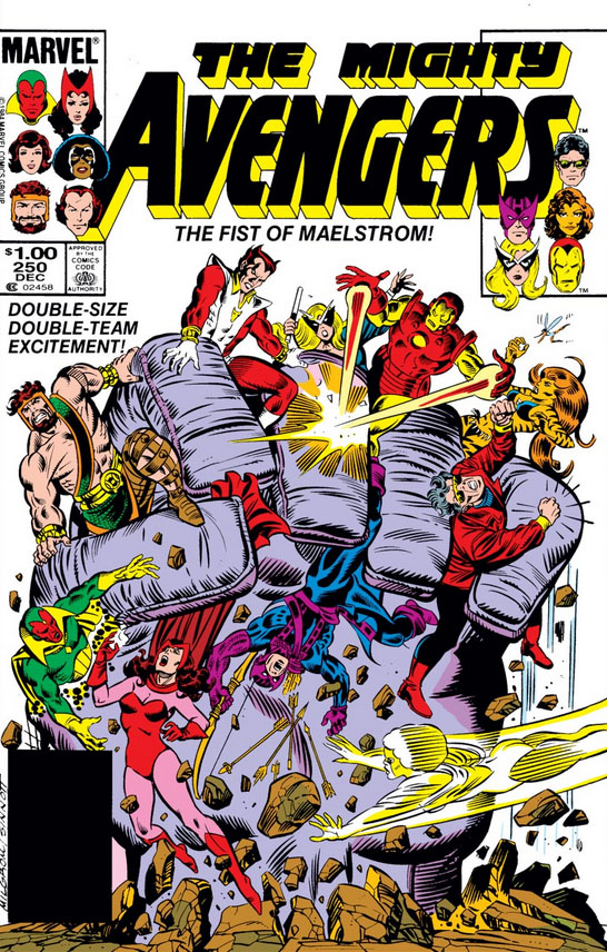 If they had removed the heads on both sides of the logo ... then it would be more acceptable and I've a hard time liking it and the font is not that good ... to me it's another bad logo and the word "Mighty" here isn't easy to read here. |
|