|
|
Post by Batflunkie on May 18, 2016 8:21:05 GMT -5
It's an ugly logo, IMHO (that font is just horrible), but it's infinitely better than that peeling band-aid thing they have at the moment - truly one of the worst corporate logos ever unleashed on an unsuspecting public. From a graphic design standpoint, it's fairly straight forward and clean looking, so it's ideal in that respect. But yes, I do agree that it is fairly uninspired looking when pared against the countless others DC has used |
|
|
|
Post by Warmonger on May 18, 2016 9:00:02 GMT -5
Much, MUCH better than the crap logo they've been using.
When that thing first debuted, I seriously stared at it for a solid 5 minutes before I could finally make out the D in "DC".
I like the new logo. Very simple and straight forward with an old school feel.
|
|
|
|
Post by Nowhere Man on May 18, 2016 10:42:09 GMT -5
I'm fairly certain that if DC conducted a large poll of the fanbase to see what their favorite logo would be this would win: ![]() ![]()  Changing logos has zero affect on sales. Or am I wrong? Why not simply go back to your most iconic logo, DC? Doesn't the fact that you've felt the need to change it THREE TIMES in ten years, when this one lasted almost 30, tell you anything? This is the kind of nonsense that marketing departments pull to justify their existence. |
|
|
|
Post by Deleted on May 18, 2016 10:51:37 GMT -5
From a graphic design standpoint, it's fairly straight forward and clean looking, so it's ideal in that respect. But yes, I do agree that it is fairly uninspired looking when pared against the countless others DC has used I disagree about the clean-looking part - the problem for me is the disparity between the large blocky (and ugly) letters set adrift in the middle of a load of white space inside the much narrower line weight of the surrounding circle - it just feels like two unconnected elements (the letters and circle) rather than a coherent unit |
|
|
|
Post by thwhtguardian on May 18, 2016 11:14:21 GMT -5
I'm fairly certain that if DC conducted a large poll of the fanbase to see what their favorite logo would be this would win: ![]() ![]()  Changing logos has zero affect on sales. Or am I wrong? Why not simply go back to your most iconic logo, DC? Doesn't the fact that you've felt the need to change it THREE TIMES in ten years, when this one lasted almost 30, tell you anything? This is the kind of nonsense that marketing departments pull to justify their existence. For the life of me I never understood why they ditched this look. |
|
|
|
Post by hondobrode on May 18, 2016 12:56:43 GMT -5
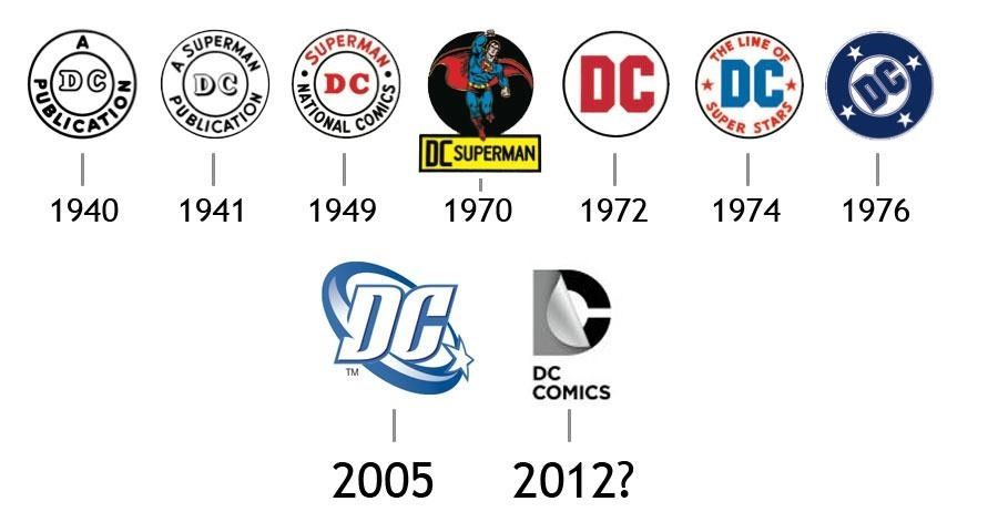 It's obviously modeled after the 1972 logo, but, that's the least compelling one IMO. I've got a soft sport for the '74 logo as that's what the first logo was I was exposed to, but I really love the classic '76 logo and the swirl version that came in '05. You can't make it exact, which is a step backwards. The 1970 Superman logo I've liked too. Batman outsells Superman (now), but Superman is still the granddaddy of 'em all and no one doesn't acknowledge that. I'd still incorporate some version of Superman into the logo with DC in there. Maybe having each letter to his side, or the Superman shield in the background with DC in the foreground. |
|
|
|
Post by Deleted on May 18, 2016 13:36:12 GMT -5
I'm fairly certain that if DC conducted a large poll of the fanbase to see what their favorite logo would be this would win: ![]() ![]()  Changing logos has zero affect on sales. Or am I wrong? Why not simply go back to your most iconic logo, DC? Doesn't the fact that you've felt the need to change it THREE TIMES in ten years, when this one lasted almost 30, tell you anything? This is the kind of nonsense that marketing departments pull to justify their existence. Because they can no longer use stars in conjunction with the letters DC in logos because of the crew up of their IP lawyers in 2005 and failed to secure the trademark & copyrights for that combo and then got served by the upstart DC shoes as I mentioned a few posts ago. This rule sout going back to any of the logos that used stars and DC, so no 2005 swoop, no DC bullet, etc. -M |
|
|
|
Post by Nowhere Man on May 18, 2016 19:28:02 GMT -5
If that's the case, that's on DC and their IP lawyers. When you come out with something first and fail to keep tight grip on your intellectual property, well, that just plan old incompetence I'm afraid. Stuff like this is very strange to me. You'd think the ubiquitous symbol of your publishing line would be one of the first things you'd take care of when it comes to IP.
|
|
|
|
Post by dupersuper on May 18, 2016 20:50:53 GMT -5
 It's obviously modeled after the 1972 logo, but, that's the least compelling one IMO. I've got a soft sport for the '74 logo as that's what the first logo was I was exposed to, but I really love the classic '76 logo and the swirl version that came in '05. You can't make it exact, which is a step backwards. The 1970 Superman logo I've liked too. Batman outsells Superman (now), but Superman is still the granddaddy of 'em all and no one doesn't acknowledge that. I'd still incorporate some version of Superman into the logo with DC in there. Maybe having each letter to his side, or the Superman shield in the background with DC in the foreground. I like 1970, 1976 and 2005, but it's not like it factors into my buying a book at all, so DC would be right not to care about my preferences in this matter. |
|
|
|
Post by Action Ace on May 18, 2016 21:07:26 GMT -5
In the off chance you are one of the five people in this forum buying new DC Comics...
DC: Rebirth comes out next Wednesday.
|
|
|
|
Post by Deleted on May 18, 2016 21:37:40 GMT -5
If that's the case, that's on DC and their IP lawyers. When you come out with something first and fail to keep tight grip on your intellectual property, well, that just plan old incompetence I'm afraid. Stuff like this is very strange to me. You'd think the ubiquitous symbol of your publishing line would be one of the first things you'd take care of when it comes to IP. They misfiled the paperwork and the delay allowed the shoe company to get their paperwork in first and register their logo. For the last year that DC used the stars and swoops logo they started in 2005, they were paying a licensing fee to the shoe company to use the logo after they got a cease and desist letter on using the logo and were facing a lawsuit form the shoe company. It's why the switched to the peel back logo that was so different form anything else they had used before in 2011/2012. -M |
|
|
|
Post by Action Ace on May 18, 2016 21:52:46 GMT -5
Jim Lee says that the logo is supposed to be a nod to the logos of Superman, Batman and Wonder Woman.
|
|
|
|
Post by hondobrode on May 18, 2016 22:03:44 GMT -5
I even went back and looked at it again and don't see it.
I guess I'm an idiot.
|
|
|
|
Post by Gene on May 18, 2016 22:19:41 GMT -5
Honestly, I've always liked the "Peel." If they had used it on the books like they do with the TV shows, it could have been a fun throwback to the old mastheads of the past. Instead, they just said "make it blue" and slapped on the corner.
|
|
|
|
Post by Action Ace on May 18, 2016 22:20:58 GMT -5
I even went back and looked at it again and don't see it. I guess I'm an idiot. I didn't see it either. Maybe I need to imagine all the logos wearing high collars. |
|