|
|
Post by Deleted on Mar 8, 2018 17:16:44 GMT -5
Miss America and Blue bolt are both good ones. Who knew the Golden age had such good logos? My next five are all Golden Age ... the final five for good!  Correction only 2 in the Silver Age ... sorry dbutler69 ... wanted to be corrected. |
|
|
|
Post by chadwilliam on Mar 8, 2018 19:14:07 GMT -5
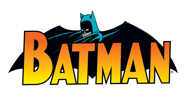
No Number 9 in this CountdownNumber 8b This logo holds two distinct advantages over most, if not all, of its competitors: 1. It incorporates the character's emblem. As great as Superman's crest is (or that of The Flash's or Spider-Man's or whoever), it's too unwieldy to also serve as his logo. That bat benefits from the fact that it can be read from left to right whereas with someone like Superman, the emblem either hits you dead on center, or with someone like The Flash, it reads from up to down. Get rid of the character's name and you're still left with something great and instantly recognizable underneath. 2. It has the character himself staring right at you. The title screams 'Bat Man', the emblem screams 'Batman', and the face screams 'Batman' and I can't honestly tell you which one I notice the most - they all hit you instantaneously. In spite of these three elements all working to convey an idea that you would still recognize even if only one had been used, it doesn't feel like overkill. Once that bat is in place in fact, it feels as if Batman's face should be right there because it fits so perfectly. This is a logo I could almost see Batman wearing on his chest. One other thing: Though it was dropped early on from the series, Batman's emblem once felt as though it had depth.  Those scallops accentuating the wings on his emblem were a detail I always liked as a kid - without them, the emblem just seemed flat. I like that they've been worked into the logo here. |
|
|
|
Post by cellardweller on Mar 8, 2018 21:10:05 GMT -5
Very cool thread! Nice to see all the logos here!
|
|
|
|
Post by Deleted on Mar 9, 2018 5:12:56 GMT -5
|
|
|
|
Post by Deleted on Mar 9, 2018 9:10:08 GMT -5
|
|
|
|
Post by dbutler69 on Mar 9, 2018 15:25:59 GMT -5
Freedom Fighters is a good one! I like your observation that it looks like a waving flag.
|
|
|
|
Post by Deleted on Mar 9, 2018 17:03:21 GMT -5
Freedom Fighters is a good one! I like your observation that it looks like a waving flag. Thank You for this comment!  |
|
|
|
Post by Deleted on Mar 9, 2018 23:20:53 GMT -5
Top 3  Green Lantern From DC Comics Green Lantern From DC ComicsSad to say this, this logo is the Best Golden Age Logo on my Countdown and I've feel kind of low putting it at Number 3 because I have two others logos better than this ... Number 2 for tomorrow and Number 1 on Sunday to wrap things up.  My Favorite Picture!  I rather wear this costume over the Golden Age Superman because this is the coolest costume ever! ... For Halloween Costume Parties !!!  I've took two pictures and merged them into one ... the top picture is the Secondary Logo that they used in the late 40's and early 50's Back to the logo, it's unbelievably stunning with the green flames and the colors are eerily mysterious and having said all that there is no real words that I can adequately describe it and I would die to own this book ... and I would prized this book over the one on top. You can throw the entire dictionary at it and still can't describe this logo. It's beyond belief and I've just find it irreplaceable and moved by its appearance and the finishing touch it's head in the center of the logo for the personal touch and used the lantern as the focus of it. A thing of beauty beyond words ... Sigh! Number 16 All American Comics!  His battles with the Icicle is legendary ...  Another Favorite Picture done by Ramona Fradon!  Last and and not least ... his marriage to Harlequin was a shocking event in his life.  Green Lantern at Number 3 ... best logo in the Golden Age of Comics ... Case Closed! |
|
|
|
Post by Deleted on Mar 10, 2018 11:33:15 GMT -5
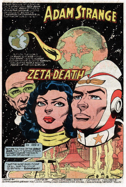
This is the Cream of the Crop as far as Justice League of America logos ... this is the BEST OF THE BEST ... the coolest thing about this logo is the red, white, and blue treatment of the word "League" and the way they did it. Red for Justice and Blue for America ... is very appropriate along with the white stars is nicely done here. You can debate it all you want ... but this logo is the coolest logo of all time for this iconic superteam of who I'm believe the greatest Super Team in all Comicdom. Case Closed, Members!  Great Splash Page of the Power Couple of Space Favorite Covers featuring Adam Strange #82  #85  #90  |
|
|
|
Post by Deleted on Mar 10, 2018 12:15:23 GMT -5
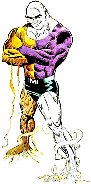
One of the most unusual and craziest logo that I've ever seen in my life ... Ultra the Multi-Alien ... You got to loved it and most of all it's the grooviest one yet! My all time favorite! Most Colorful and Dynamic One Yet! Pictures of it ... say it all the BEST ONE THAT I'VE EVER SEEN!  This is an excellent story and I highly recommend it ... Have the book too. They even made it an action figure too!  Cool Picture of Ultra  Even made an appearance in the Adventure of the JLU Universe too.  Great Splash Page too  It would be so cool if they teamed him up with Metamorpho ...  I'm all done with my 150 of the Greatest Logos of all time ... DC, Marvel, and couple others Companies as well ... thanks for all the comments! |
|
|
|
Post by MWGallaher on Mar 10, 2018 19:02:41 GMT -5
Well, I'd be willing to bet no one saw that coming as your number one choice, Mechagodzilla!
Thanks for a fun countdown. I was a little surprised at some of your choices, and occasionally puzzled at your criteria--I don't usually consider the coloring as part of the logo, since unlike most commercial products, comic book logos have rarely had a consistent "official" color (unlike, say, Tide detergent or Coke, that have color choices as a major part of their branding identity). It's a little surprising that modern logos don't settle for a consistent color, but I suppose the different dominant colors on the cover illustrations might make some logo colors inappropriate for a particular issue.
It appears that you're a softy for the old red, white and blue, and there's nothing wrong with that!
|
|
|
|
Post by Deleted on Mar 10, 2018 23:41:13 GMT -5
Well, I'd be willing to bet no one saw that coming as your number one choice, Mechagodzilla! Thanks for a fun countdown. I was a little surprised at some of your choices, and occasionally puzzled at your criteria--I don't usually consider the coloring as part of the logo, since unlike most commercial products, comic book logos have rarely had a consistent "official" color (unlike, say, Tide detergent or Coke, that have color choices as a major part of their branding identity). It's a little surprising that modern logos don't settle for a consistent color, but I suppose the different dominant colors on the cover illustrations might make some logo colors inappropriate for a particular issue. It appears that you're a softy for the old red, white and blue, and there's nothing wrong with that! You are right on the nose regarding the Red, White, and Blue ... just to tell you ... this countdown of 150 logos is reflected on my own reading habits and I've read 65 percent DC and 35 percent Marvel. I tried to be fair to all the logos on this countdown and I have a great fondness for Golden Age who dominated in the top 20 ... This is the most difficult undertaking and having said that ... I spent time reshuffling the order while I'm at it. I'm not a fan of any of the modern logos at all ... very few made my list and that's a big disappointment for many of you and I've admit that I didn't read much comics after the year 2000 and any other titles beyond that. So ... thanks again and appreciate it very much. As far my NUMBER ONE ... I knew about this character for more years than most people here ... and that logo is about unique at it very best.  I've seen all these logo being used in the Silver Age of Comics and that's why it's landed in the top spot in my Countdown ... U, L, T, R, and A ... all in different colors and that's alone cemented it. And, a no-brainer for me! Case Closed  |
|
|
|
Post by Deleted on Mar 10, 2018 23:45:42 GMT -5
Well, I'd be willing to bet no one saw that coming as your number one choice, Mechagodzilla! Thanks for a fun countdown. I was a little surprised at some of your choices, and occasionally puzzled at your criteria--I don't usually consider the coloring as part of the logo, played a major part of it and I've want to address that ... it's gives the logo an identity and that's what makes it unique. It's very, very important to me and that's why I've made it a factor of it in this countdown. |
|
|
|
Post by chadwilliam on Mar 12, 2018 22:32:19 GMT -5
Congratulations on another great list Mecha, I really enjoy these and am looking forward to whatever you have planned next. That's a great pick for number one - it makes me think of all those covers DC put out during the Silver Age where someone would come up with a crazy cover image first and then have the writer create a story around it. That uLTrA logo looks cool enough that some artist could have come up with the design first and then said "now we've got to come up with a character to go along with it". Interesting that your number one pick didn't have his own title to display that logo properly though. I do think the Carmine Infantino Batman logo below should have made the cut though.  Also; I love that Green Lantern logo as well (#3). It really captures the supernatural flavour Alan Scott had early in the strip's run. He really felt like a good guy wielding a very sinister power in those stories and those flames with his face at the center keeping things in check nicely sums up the balance of power in the title and hints at the precarious nature of just how dangerous the lantern itself might be. So what do you have planned next or is it to early to say? |
|
|
|
Post by Deleted on Mar 13, 2018 3:17:19 GMT -5
Congratulations on another great list Mecha, I really enjoy these and am looking forward to whatever you have planned next. That's a great pick for number one - it makes me think of all those covers DC put out during the Silver Age where someone would come up with a crazy cover image first and then have the writer create a story around it. That uLTrA logo looks cool enough that some artist could have come up with the design first and then said "now we've got to come up with a character to go along with it". Interesting that your number one pick didn't have his own title to display that logo properly though. I do think the Carmine Infantino Batman logo below should have made the cut though.  Also; I love that Green Lantern logo as well (#3). It really captures the supernatural flavour Alan Scott had early in the strip's run. He really felt like a good guy wielding a very sinister power in those stories and those flames with his face at the center keeping things in check nicely sums up the balance of power in the title and hints at the precarious nature of just how dangerous the lantern itself might be. So what do you have planned next or is it to early to say? Because this year is a very hectic year and I'm already started on personal projects and all and sad to say this is my last list that I'll be doing ... I just can't start on up until after Labor Day and knowing that and my age ... it's getting harder for me to do something next. I just can't see myself doing anything else ... I've thought of doing a villian logo countdown and there are very few of them and can't even do a 50 and/or 100 because that would be impossible to do. Sorry about that. |
|